 Last month, Time Inc. announced a new “customized magazine” project it’s calling Mine. The idea is that you tell Time Inc. which of its magazines you like, and it’ll send you a customized set of issues combining content from each. I was on the record as skeptical, since I think customization is something the Internet will always be able to do better than a printed magazine can — and I don’t think that customization is, fundamentally, what people want when they read a magazine. They want someone else’s vision of what is important or interesting or enthralling.
(That said, it appears this experiment is costing Time Inc. little or nothing, since Lexus came up with the idea and is buying ads in the issue. So I figure it’s certainly worth trying — if only to see how customized printing scales with current press technology.)
Anyway, I got my copy of Mine in the mail yesterday, and it’s something of a puzzle.
THE CONTENT
When I signed up last month, I had to pick five of the eight available Time Inc. magazines. I went with Sports Illustrated, Food & Wine, Golf, Travel & Leisure, and InStyle, leaving behind Time, Money, and Real Simple. That wasn’t a particularly accurate-to-my-tastes customization: I’ve never golfed on anything larger than a putt-putt course, for instance, and I chose InStyle in particular to see whether it would customize the selection of articles — since, as a man, I’m not its traditional target audience. But the range of available choices wasn’t particularly inspiring to begin with, considering all the titles Time Inc. publishes. It’s like a buffet where soup is the only option.
I’m no expert on printing technology, but I do know it’s come a long way in recent years in its ability to do short runs (or even one-copy runs) efficiently. On-demand publishers like Lulu are based on that progress. Mine is printed on thicker stock than the Time Inc. magazines I’ve seen, a bit like less shiny home photo-printing paper. It’s not bad, by any means, but it feels a little like a school project. The sections (each devoted to one of the magazines) are fronted by a plain white page with the magazine’s logo — nothing more.
The content is of typical Time Inc. quality (since it comes straight from their magazines), but it’s old. The main Sports Illustrated story is from last June, and concludes with a reference to “a World Cup qualifier two weeks from now” that was played June 22. An InStyle article is from last July. The main Food & Wine story is from the April 2007 issue, and one of the Golf pieces is also from 2007.
Why so out of date? I imagine Time Inc. didn’t want to give readers who subscribe to any of the other magazines pieces they already read last month. But it feels odd to be customizing with two-year-old features.
And, for the record, the InStyle material looks like traditional InStyle material — they didn’t throw me a male-oriented curve like “How to buy clothes for your girlfriend” or anything.
THE ADVERTISING
The key element in Mine — the reason it’s a worthwhile experiment — is the ad copy. Lexus is the only advertiser, pushing the 2010 RX with three inside full pages, the back cover, and the wraparound strip you see in the above photo. This is, as far as I can tell, the only part of Mine that’s actually customized to the individual reader and not simply cut-and-pasted from other magazines. Unfortunately, for me at least, the ads are just customized enough to be a little creepy, but not customized enough to be unusually effective.
Here’s the back cover:

Okay, fine — having your name in an ad is pretty impressive just from a logistics standpoint. And we’re used to seeing our names printed on the outsides of magazines — just not in big type. Here’s the inside front cover:

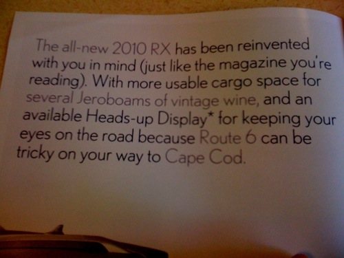
You can see here that the customized elements are the ones in the lighter gray. But “several Jeroboams of vintage wine”? Seriously? The only wine I ever buy is eight bucks at the supermarket two blocks away, and I’ll take a Shiner over it any day. Did it guess I’m a wine fiend just because I picked Food & Wine as one of my choices? Or is it some magical alchemy based on my zip code (which, I suspect, is pretty wine heavy)? And mentioning Route 6 and Cape Cod (neither one of which I’ve spent any time on) feels, I dunno…a little invasive, somehow.
The next left-facing page:

Again with the food and wine theme. Did everyone who picked Food & Wine get these ads? The people behind the counter at Qdoba will be surprised to hear of my love of “fine food.”
Finally, here’s the inside back cover:

If we can believe our light-gray-equals-customized system, the mention of the headlights is also targeted just at me. Perhaps other people got something about floormats. Again, there’s something about the mention of my neighbors in Cambridge that feels invasive. I don’t think it would feel that way online, where we’re more used to seeing a web page evolve in response to our histories or preferences. In print, it feels off.
So, is Mine a success? If Lexus’ ad dollars covered Time Inc.’s costs, then hey, why not try something new? It generated some free publicity for Time’s titles, and it could potentially expose some readers to magazines they’d enjoy but had never had the opportunity to pick up. And eventually, if more advertisers got on board, the ability to microtarget ads to reader interests could be very lucrative. So it’s a worthy effort. The Mine web site is now asking readers questions aimed at better customization (“Which do you crave more: sushi or pizza? Who would you like to have dinner with most: Leonardo da Vinci or Socrates?”), so maybe the content targeting will improve too.
But does Mine, in its current state, make me more likely to want to buy a Lexus, or to read another issue of two-year-old rehashed Time Inc. copy? Not particularly.