Early this morning, Jay Rosen rolled out a new version of his website, PressThink.org — the first redesign the blog has undergone since it was born seven years ago. The new interface is cleaner than it used to be, with wider spaces, sharper colors, tabbed navigation, and even visual branding (check out those spectacles!). For someone like the NYU journalism professor, though, whose thinking falls under the broad categories of “engagement,” “participation,” and the like, a redesign isn’t merely about aesthetics. It’s also about conceiving of a website as an invitation to interaction: a mechanism, to be only momentarily McLuhan-y about it, whose power as a portal into discourse lives and dies with its design.
With that in mind, here are some particular changes brought to PressThink, via the designer Rosen worked with, Lauren Rabaino:
* Jay’s glasses in the header image. It’s very signature “Jay.” (We’re also throwing his glasses at the end of each post to signify that *this* marks the end of Jay’s thoughts).
* Paragraph-level permalinks — which are a necessity for such long posts
* “Talks” page, which is a chronological documentation of Jay’s talks, interviews, etc.
* The “bio” page which allows anyone to grab the HTML version of Jay’s biography for republishing!
* The blog is now on WordPress! Open source FTW!
I talked with Rosen this afternoon, on Gchat, to learn more about the thinking behind, and the goals for, those changes. The following transcript is lightly edited from the original Gchat-ese.
 Megan Garber: I liked, in particular, that the new format allows users to link to individual grafs in the posts. What was the thinking behind that? Did Dave Winer and the design of Scripting News have anything to do with the inspiration? [Winer, one of the earliest innovators in web publishing, is currently a visiting journalism scholar at NYU.]
Jay Rosen: Yes, I stole that idea directly from Scripting News. I had been using a hand-coded version of that for a while on my old site, but that was something I knew I wanted to build in.
But links to paragraphs was part of something bigger. I had one site and one design from the start of PressThink in 2003 to 2010. In that interval, I had learned a lot about the web, the web itself had moved and developed, and I had gained an acute sense of my own blogging style and online presence. So the goal of the redesign was to incorporate that movement, and all that learning, into a new PressThink.
Thus, I know that sometimes I want to be able to link to a specific argument I have made in the past. I know this from doing it on Twitter. Like here, for example: http://archive.pressthink.org/2010/02/21/innocence.html#innocence. So I took what I have learned about “doing ideas online” and brought them to Lauren as requests. (That’s Lauren Rabaino, a young designer and journalist who was is a very serious PressThink reader, and also one of the first people I put on my Young Smart Newsies list. In fact, when I said I wanted to borrow something from Scripting News, she guessed what it was in three seconds.)
MG: Yeah, you’d want to have someone who could really, to use your term, grok the site (and, more broadly, your way of thinking). How did you two connect beyond the blogger/reader relationship — how did she come to get the job of doing the site’s redesign?
JR: I asked her and she said yes. I wanted someone young to do it, and I admired what she had done with Spot.us.
MG: Why someone young?
JR: Because her generation of digital journalists is a substantial part of my online constituency, and because I felt that the meeting ground between my sensibility and hers would put the design right where it needed to be, and because I like to give opportunities to young people when I can, as with David Cohn and Pat Thornton.
MG: And if we can go back to the learning-from-the-web idea: I’m curious, first of all, what those general lessons have been. I know you could probably write a book, or several, about them, but, briefly, what are the broad takeaways that informed the redesign?
JR: Here are a few:
— Make it easy to use and intuitive to interact with. I wanted Lauren to use everything she knew about what makes long form readable, and I think she did. Cleaner is better as people spend more time online. I wanted the new PressThink to clear a space, not just be a space online.
— Open source and technology with a community of developers around it is winning, so that informed the choice of WordPress [from the previous CMS: Movable Type].
— Certain lessons about personal branding for writers and journalists also went into it, such as you see here. I try to maintain a single identity, voice and intellectual style across everything I do, and to never lose the tight focus on a few things that define what I do, so the site had to help me keep doing that.
— I have never bought the idea that long-form writing and depth of reflection don’t work online. I think there is plenty of web wisdom that says they do, so that got incorporated, too.
MG: Speaking of that, and of branding/web identity: How do you imagine the new PressThink will interact with your other sites — your Twitter feed, Posterous, FriendFeed, etc.?
JR: FriendFeed has basically died, so that is past tense. Posterous: my idea was to use it for less finished, more notebook-style stuff, but I sort of used it as a second PressThink for a while, so I may get back to that original idea. Twitter, that’s more complex. I would say that PressThink is where you go to understand why I say what I say on Twitter.
One of the ways I used Twitter to go into depth — even though everyone says, “How can you go into depth in 140 characters?” — is by seizing on certain themes, branding them with my own terms, and then displaying those terms on an endless series of provocations — as with the church of the savvy, the view from nowhere, the museum of the curmudgeons, etc. And all those themes have their counterparts in PressThink posts, where they are explained and grounded.
So that’s the relationship. But if you follow the savvy as it appears and reappears in my Twitter feed, over time I feel you are getting a sensibility in-depth, despite the character limit.
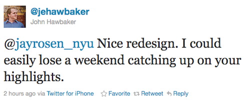
And I have to add something, not directly on your question. Someone just tweeted this; take a look:

Now that makes me smile — because this was another thing I wanted the design to accomplish. Blogs actually suck at displaying a body of work that has unfolded over time, right? The posts roll on and disappear from the cover, unless you take specific measures to counter this. So one thing I wanted in the new design was to make an entire body of work accessible to the visitor with one or two clicks. That’s why I have not only recent posts but highlights, and why I explain what those highlights are. And not only a blogroll, but a recommended list, which explains why my site is in conversation with those sites. So the hope is that someone really interested can lose a weekend, and if one person a week does that, this works for my purposes.
MG: Interesting. So, to some extent: the future of context, in action?
JR: Yes. Or to put it another way: not the river of news but a landscape of thoughts. But this is all part of my determination to have a very tight focus on a few things and almost never stray from them.
MG: So the centralization comes not as much through the platforms, but through the ideas…
JR: Right. Because…well, you’re familiar with the biologists’ hunch that every human being has one common ancestor. Everything at PressThink is a child of a single idea: that if people participate in it the press will be better, stronger and smarter. [This, by the way, is an extension-by-way-of-inversion of a nice idea Rosen recently articulated to The Economist: “Journalists should describe the world in a way that helps us participate in political life.”] And journalists should understand and appreciate this fact.
Also, there’s a related idea in the site’s header and logo, the old one and the new one:

The press we have is to some extent a reflection of certain key ideas that lie “behind” it. And this is what I call PressThink. So the logo tries to suggest that. And I am trying to smuggle into the press certain key ideas that in my view should lie “behind” it…my pressthink. And the logo is about that. PressThink has always gestured back in time; that is why it’s not called MediaThink. So make of that what you will.