When Gizmodo editorial director Brian Lam was planning for this week’s coverage of the Verizon iPhone, he didn’t think in words. He visualized it entirely in images, daydreaming about how much more emotive pictures and sounds can be than straight-laced text: A Ken Burns-style montage of past newspaper stories predicting iPhone’s migration; a video of AT&T’s greatest failures; customers expressing frustration layered with soulful, gut-wrenching music.
On Tuesday, the editorial package still featured a lot of text — Gizmodo ran a series of traditional news and service pieces plus a one-minute rant — but Gizmodo did have some original art: a Verizon-red light dawning over the shiny iPhone (“At Last”) and a projectile phone crashing through the telecom’s Manhattan headquarters (“Will the iPhone Crush Verizon’s Network?”).
Most online journalism privileges text over all else. But to help Gizmodo differentiate itself from the countless other technology sites around, since early summer, contributing illustrators and guest artists have been whipping up hundreds of visual pieces for Gizmodo. And the response has only made Lam’s love of the visual grow stronger. “If I needed to, I would have napkin sketches done,” he says. Cartoons, illustrations, and drawings can add a nice touch in the Internet environment where text stories are aggregated, chopped up, syndicated or simply re-skinned and re-written without giving credit. Art, on the other hand, is treated as a more proprietary piece of intellectual property and can catch a reader’s eye, build a brand’s signature style, and help tell the story. Plus it can also be a cheaper, more flexible alternative to original photography.
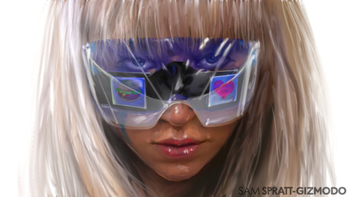
At the recent Consumer Electronics Show, Gizmodo wrote about Lady Gaga’s Polaroid glasses, but there was no picture of her with them. “How much would [a photo shoot] cost? Thousands of dollars, weeks to set up?” Lam asks rhetorically. Perhaps, but Lam didn’t have to go that route. Instead, Sam Spratt, a 22-year-old contributing illustrator, drew the Gaga image above in half an hour.
 Spratt has been working with Gawker since July and was onsite at CES, but he typically creates from a home studio, another advantage of hand-drawn art. Like journalists who can gather information, sources, and anecdotes with just a phone and computer, illustrators don’t always have to be on location to create original, entertaining, and informative content. Wendy MacNaughton, a San Francisco-based cartoonist who spent a month working with Gawker, drew the clever Fission vs. Fusion sidebar (left, click for the full image), which for many will be light years more engaging than a string of quotes from a CERN scientist. “They’re the shiny objects that hook people in enough to see the real meat of the package: the article,” Spratt says of his drawings. (Readers simply ignore stock images.)
Visuals are already a Gawker signature — its editorial teams mine the Web for colorful images to fill image-heavy layout. Still, Lam, who came to Gizmodo from Wired in 2006, pushed founder Nick Denton to fund original art. “Every year, we discuss budgets, and I said, ‘You really think another writer on top of a ten-person staff is going to make a difference?'” Lam recalls. In 2007, Gizmodo brought on Jesus Diaz, a writer and editor with a background in visual and graphic arts. He frequently built images in Photoshop, created unique infographics and timelines. “There was a lot of punch in those posts,” Lam says of Diaz’ work. “You just start to dream visually from that point on.”
To fulfill that dream, Gawker started adding creative personnel. MacNaughton came on for a month last summer, painting 15 water colors including a biting take on the iPhone 4 and the classic infographic for No Sleep ‘Til Fusion. Chris McVeigh, who worked with Gizmodo for a couple of months, built and photographer Lego dioramas. Both artists add beautiful visual originality to text, a complement that’ll only get more vital as we move toward tablets and Internet TV.
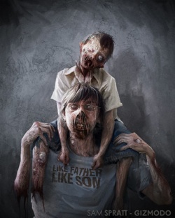
 The difference between another writer and an illustrator is most apparent with Spratt, though, who has done more than 400 pieces since July. There’s pure editorial work (like Verizon and Gaga), but he also helps make Gawker Media’s community-engagement more robust. For a Halloween contest, he painted an eerie father-and-son piece, and last month, Spratt rewarded Facebook fans by painting 14 of their profile pictures. The recent Savannah College of Art & Design grad maintains his own Facebook page — 4,300+ fans — and a formspring that attracts aspiring artists, supporters, and a more than a handful of swooning women.
As with Gawker Artists, the company’s use of visuals makes the site more vibrant, engaging, interesting, and unique. It also allows for more flexible editorial modeling and attracts a wider audience than, in the case of Gizmodo, gadget writing alone. There is nothing to fear by bringing on illustrators. If we’re wary of mixing cartoons with traditional journalism, we shouldn’t be — just look at The New Yorker’s fantastic work, their extensive lines of mugs, diaries, prints, umbrellas, postcards, and calendars. We already know our audience loves illustrations — Avatar is the highest-grossing film of all time, and The Simpsons is the longest-running show on TV. “The longer I work at Gawker, it really encourages you to go with your gut,” says Lam. “I think that everyone should try to do this.”
