Since just about any news organization might have reason to cover an election at some point — and since we here in the U.S. are edging closer to our own two-year marathon — we thought it might be useful to look at how one upstart Irish online news outlet, TheJournal.ie, is using social media data to examine the sentiment of the voting public. Irish newspaper and web designer Fergus Kelly reports.
My favorite webpage of the entire election campaign is The Journal’s #ge11 Twitter Tracker, launched earlier this month. It’s brilliant. In essence it presents an analysis of the tweet stream in Ireland, showing which parties and party leaders are being talked about most and the attitude of the public to the party leaders in a very graphic and simple to understand way (much, much simpler than that last sentence). I look at it several times a day, watching for changes in volume of tweets and how people are feeling about the parties.

The Journal‘s aim is to innovate in the Irish media sector and to encourage users to be part of the process, a socialization of news that is gathering momentum worldwide. It is now my first port of call for finding news. The Twitter Tracker follows on from interesting ideas like the 9 at 9 (nine things you need to know at 9 a.m.), Take 5 (five things you need to know by 5 p.m.), the Daily Fix (its pick of the highs and lows of the day’s election campaign), and daily polling — delivering bite-sized, curated, interactive, and realtime news.
To help create the tracker, The Journal turned to Clarity, a partnership between University College Dublin, Dublin City University and Tyndall National Institute (TNI) Cork. Adam Bermingham, a Ph.D. researcher with Clarity, told me that it is “aiming to turn raw data from the (usually social) web into meaningful and valuable information which is easily consumed and understood.”
“For the Twitter Tracker project, we have applied the technologies we have developed over the last few years to the political domain to provide analysis, which has been visualised and editorialised by TheJournal.ie,” he said.
That editorialisation and visualisation is pretty good. The best feature of the Twitter Tracker (very graphically) presents the most talked about party leader on Twitter, with the option of analysis of the Last Few Hours, Last Day, or the Whole Campaign. It uses the size-of-head metaphor to graph the data — the biggest head is the most talked about — and it can be most amusing. Sentiment is visualised using something like the Swingometer popularized by the BBC for election coverage.

It also has a graph of the volume and sentiment of tweets about the parties over the past week, showing the most talked-about party. This graph is (only occasionally, unfortunately) annotated with stories from The Journal to explain spikes in the graph, and the dates it covers can be adjusted.

The top trending candidates in the past day or week are also displayed, with a short profile of each to explain who they are.

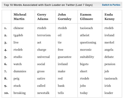
The top 10 words associated with each leader and party over the past week is also enlightening. For example, at the time of writing, the word most associated with Labour’s Eamon Gilmore was “Taoiseach,” while this was only eighth for Fine Gael’s Enda Kenny. I wonder why?
“The top terms are important terms which have been uniquely mentioned in relation to the leaders or parties in question. In this way we get an idea of what concepts have a strong association that is intrinsically linked to that leader or party,” Bermingham said.

Finally, the tracker looks at the top retweets. This feature is based only on the new Twitter retweet format and therefore may not give a perfect result. Adam told me he had “developed a solution for the old school retweet [RT] but there is inevitably a problem in being able to say for sure where an old school retweet first originated. This remains an exercise for future work!”
Clarity attempts to provide analysis “beyond simple data such as word clouds and search results.” This idea becomes clear in the sentiment analysis feature of the Twitter Tracker. Clarity has developed methods to create high-quality training data from human input which is then “mined for patterns and used by state-of-the-art machine learning algorithms to identify sentiment in new data.” In other words, once their system has been trained, it can analyze anything — in this case a real-time stream of tweets — and identify attitudes. Its technology is able to do this in less than a minute.
The tracker has been looking at #ge11 on Twitter. I wondered how the central control of social networking accounts, notably by Fine Gael, may skew the analysis.
Adam said: “We don’t skew our analysis towards or away from particular sources/users. While this is possible, and even advisable for certain applications, we felt that for this election, the first general election in Ireland to be influenced by Twitter, it is valuable to present a zeitgeist of the electorate as well as the candidates, parties and party members. What we aim to do is to help people, who may not be familiar with Twitter, understand the fabric of Twitter, as it is being used, by everyone who has something to say about the election.”
The Journal is one of the most innovative news websites in Ireland. Its use of Huffington Post-style aggregation, coupled with internally generated news (with a target of a 50/50 split), broke new ground in Ireland. It’s part of the same group, Distilled Media, that created daft.ie, boards.ie, and adverts.ie and has an advertising-driven business model but currently only carries ads for other companies in the group. With more high-tech partnerships with emerging tech companies, sites like this can only add choice and therefore increase innovation in a behind-the-curve market like Ireland.
A version of this post originally appeared at Fergus’ website.