
I’m pretty sure there isn’t a category for Best Use of Webfont Formats, so ProPublica will probably have to remain happy with the two Pulitzer Prizes it’s already won. But a tiny little project out of the nonprofit news giant is worth an attaboy.
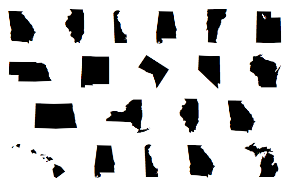
ProPublica just released StateFace, a webfont that, in place of standard letters, contains maps of the 50 states. (Plus the District of Columbia. Sorry, Guam.) Dingbat fonts are nothing new, and Unicode has helped bring font-characters-as-tiny-graphics closer to the mainstream.
But StateFace is purpose-driven, marrying typographic technology with editorial needs. ProPublica’s using it as an easy way to get state maps onto its Super PAC tracking page. You embed the font files as you would any other webfont, with a simple CSS call from your server.
Here’s the Gulf Coast, for instance. (Warning: This won’t look right in an RSS feed or some other non-web environment, I’d wager.)
On the back end, those states are really just the random-looking string “qRYBJI”; R equals Louisiana, J equals Georgia, and so on. You can select them with your mouse and copy them into a text file if you want.
And the glyphs are detailed enough that they can be scaled up quite large. Here’s Louisiana at 300-point, and just for fun, crawfish red:
(We Louisianans wish our southeastern coastline was still that lush and full, but that’s another story.)
The vagaries of web typography also mean you can do things like italicize a state — imagine a strong breeze was coming in from north Texas:
ProPublica’s Scott Klein is proud of the little details:
Tiny things I like in StateFace: We kept Block Island in R.I. and Great Salt Lake in Utah. #humblebrag propublica.github.com/stateface/
— Scott Klein (@kleinmatic) March 20, 2012
From what I can tell from the github repo, Jeff Larson and Klein were the main drivers behind the project. (An exercise left to the reader: Be the first person to make a complete map of the United States using this webfont and CSS absolute positioning.)
Now, I imagine that “making fonts with tiny maps in them” probably didn’t rank high on the Sandlers’ wish list when they gave the initial gift to fund ProPublica. But nonetheless, once the developers went through the trouble of solving their own problem, they took the extra step of releasing their work for others to use.
It remains one of my favorite things about ProPublica that it is so committed to sharing both its work and the tools it builds to create that work. Read its Nerd Blog and you’ll find tools like Simple Tiles (a map imaging tool), a small stepper graphic library, TimelineSetter (for, duh, timelines), a guide for scraping data from the web, a tool for connection graphics, and more.
Those are all valuable additions to the journalist-coder toolkit. So even though I don’t imagine I’ll ever have a use for an inline map of New Mexico, I raise a toast to the open-source sensibilities of ProPublica’s nerds.