
Step aside, Financial Times and Quartz — there’s now a higher-profile adherent to the HTML5 web app faith.
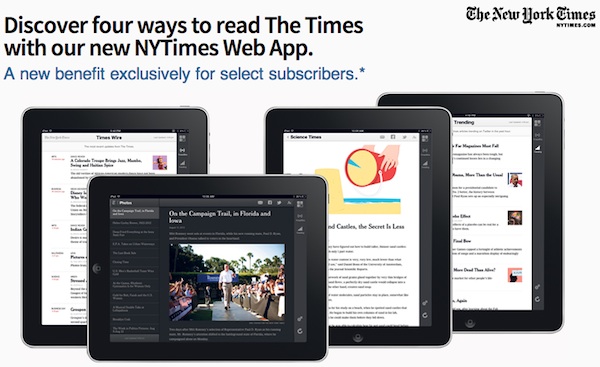
The New York Times today debuted an HTML5 web app for iPad users. The FT broke ground by abandoning Apple’s App Store in 2011 and investing in an HTML5-driven experience that could readily cross platforms — and didn’t require giving Apple its 30 percent vig. Quartz drew attention just a week ago by debuting a new business-news site that aimed high demographically but bet on a sharable web platform over native apps. And yesterday’s Pew study — which found mobile news consumers using the web over apps 2-to-1 — would seem to support a web-first strategy.
But as we’ve explored here before, going web-first still comes with a mix of advantages and disadvantages. And, as is the case whenever The New York Times does anything, lots of news organizations will likely to watch its moves and, six months later, follow in step. So what does it mean for the Times to build an app-like experience — and, it should be said, a pretty darned good app-like experience — on the web? A few thoughts:
The Financial Times abandoned its iOS apps entirely in favor of a web app strategy. And Quartz never had iOS apps to abandon. The New York Times, on the other hand, has invested significant resources into being platform-native, building out apps for iPhone, iPad, Android, and Windows Phone, along with Times Reader for desktops and laptops and plain-vanilla NYTimes.com. (They did jump off the Good Ship BlackBerry this summer, knowing a Titanic when they see one.) Arthur Sulzberger has spoken about the need to be “platform agnostic”; one can read that as an endorsement of being on lots of platforms, or one can read it as an endorsement of being on HTML5 everywhere.
(At the moment, that cross-platformness is more theory than reality. While a web app can run on almost any device, the Times web app says it will only install on iPads and in Safari. Presumably that could change as more tablets gain popularity.)
It makes sense for the Times to build an HTML5 platform; at a minimum, it can eventually fill in the gaps for platforms that it doesn’t want to develop native experiences for. (A particular issue as tablet sizes metastasize from 5-inch to 10-inch and beyond.) But I wouldn’t read this as writing off a native-app strategy just yet; this app seems to be more a supplement than a replacement. A good HTML5 app can obviate the need for a native app — but the Times already has a pretty darned good native app on the iPad, one that’s better in most ways than what debuted today.
Then again…it could someday serve as a useful hedge against Apple and the power of both its App Store and its 30 percent cut. (That said, I doubt Apple’s in any mood to be friendly to the NYT these days.)
Update: As Times emerging platforms editor Fiona Spruill tweeted:
@slowernet Would have required more work and we wanted to get it out the door. Hope to have it working on Chrome sometime soon.
— Fiona Spruill (@fionaspruill) October 2, 2012
I don’t want to sound like a broken record, but the Times web app doesn’t feel nearly as smooth or app-like as its native iPad app. It feels a bit like an older version of Android — scrolls are a little jerky, taps a little less responsive. The most recent version of Android included something called Project Butter to make the UI dairy-smooth, and that butteriness is what’s missing from the Times web app.
There are a variety of reasons for this. Most obviously, native apps will almost always have the edge over a HTML/JavaScript mashup. But on top of that, Apple doesn’t give access to its Nitro JS engine to self-contained web apps, which is how the NYT wants you to access the site. As web developer Nathan Huening put it on Twitter yesterday, it’s really, really hard to create an HTML5 experience that feels as smooth as a native app:
Web developers, it’s a simple rule: never, ever hijack my device’s native scrolling. It will always be a worse experience #always
— Nathan D Huening (@sprockethouse) October 1, 2012
In the long run — or even the medium run — it’s likely that this problem will go away. JavaScript engines get faster; CPUs get faster; the computational needs of a decent scrolling view aren’t particularly absurd. But in the short term, it’s likely that the web app will feel cheaper and less developed than a native app. And that’s important — both because users get frustrated quickly at a janky user interface and because the Times serves a high-expectation, high-demand audience. The frustration index here isn’t quite as high as it is with Quartz, which is mixing in some new user interactions in addition to its JavaScript, but it’s still an issue.
In other words, if I were a native iOS developer at the Times, I wouldn’t be too worried about my job.
The Times’ web app is “available exclusively to NYTimes.com + Tablet subscribers, All Digital Access subscribers and Home Delivery subscribers.” In other words, not only is this app unavailable to non-paying customers — it’s unavailable even to paying subscribers at the lowest tier. (For the Times, that’s the $15/four weeks level for NYTimes.com + Smartphone.)
The delicate dance of any paywall is figuring how to maximize revenue at all price points. There are some people who will pay $15 a month — how can you get them to pony up? But there are others who will happily pay $30 a month — how can you harvest their money at the same time?
The Times’ tiered structure is based on devices, which at one level seems retrograde — the paper’s offering the same set of stories on any device, after all. But in the long term, maximizing digital subscription revenues will depend on the paper’s ability to move people up that value chain — not just from free to paying, but also from paying a little to paying a lot. Trimming the number of free articles per month from 20 to 10 was a move in that direction. And if this web app catches on, that’ll be another small push for some bottom-tier subscribers to level up.
(Also of note: The web app features some really quite prominent ads, all of them currently for Lincoln, which was also launch partner for the Times paywall last year.)

Times Wire — the pure river of all Times content, from the smallest blog post to the most epic magazine piece, ranked only by time published — has been with us since 2009. But it’s spent that time buried, snuck into two links a ways down the NYTimes.com front page. I wouldn’t be surprised if 95-plus percent of NYTimes.com readers had no idea Times Wire exists, and I’d be shocked if it got even one percent of the Times’ homepage’s pageviews.
But in the Times’ web app, Times Wire (rendered as TimesWire, no space — the paper hasn’t been consistent about it, to the frustration of anal-retentives like me) gets a prime spot in the sidebar, just below the main navigation. I’ve written before about the tension between an editorially driven front page and the allure of simple reverse-chronology — most recent story at the top, everything else below — and this app seems to be the closest the Times has come to giving both equal weight.
Personally, I find Times Wire to be usefully disorienting. It’s always excellent evidence of the wide range of stuff the Times produces — from Connecticut restaurant reviews to City Room tidbits to brunch recipes. Times Wire gives you an entirely different perception of the Times — one that, in timely acknowledgement of Punch Sulzberger, acknowledges how much of its work is in the “softer” sections.
Along with Times Wire, the web app also promotes a “Today’s Paper” view, which promises to recreate the experience of reading the print New York Times, section by section. The carefully manicured layouts are gone, but the basic story assemblages remain — Front Page, International, National, Business Day, et al. (The main NYTimes.com also offers a similar view, but somewhat less prominently than the web app does.)
The inclusion of a Today’s Paper view makes me think the Times means business with this web app, because so many of the Times’ highest-value customers want that print-aligned view. It’s a print replica without being an actual print replica, and the Times wouldn’t bother with it if it didn’t expect or want established print readers to be interested in the package. While I read the Times almost completely online — I’m a Sunday print subscriber, but it almost never comes out of that cellophane bag — I will confess an attachment to a print-centric view, if only because it has an end. Twitter never ends; Facebook never ends; NYTimes.com never ends. But Today’s Paper? That ends, and that point when you’ve swiped past the final article provides a satisfying sense of closure that a river of news never does.
One other view — and I hope you’ll forgive me for obsessing a bit on how news organizations choose to rank and present their stories; it’s a sickness — the Times promotes is a new “Trending” view. It promises the “most popular New York Times articles trending on Twitter in the past hour.” You might even say it’s a New York Times-specific cousin of our own Fuego. (Did you know we have a last-two-hours view of Fuego? It’s called Supafresh. Shhh.)
The Times has built its social ranking of stories around a few key metrics — most emailed, most popular (pageviews, one assumes), and most blogged (as determined by NYT-owned Blogrunner). But I think it’s safe to say that social relevance of news is determined more by Twitter traffic these days than by blogs or email. The universe of independent, content-driven blogs has withered or corporatized; email, while still powerful as a distribution mechanism, is no longer the primary sharing tool. While Facebook no doubt still drives more traffic to NYTimes.com than Twitter, it’s that little blue bird that has become the heartbeat of news distribution among Times readers.
There’s a reason the Times R&D Lab’s Cascade tool looks at Twitter, and it’s not just a flexible API — it’s because Twitter is, in a real sense, the new wire service. So it’s interesting to see Twitter’s social pulse used to recommend stories to Times readers. I wonder how long it’ll take for this web app view to make its way back to the mothership at NYTimes.com.
Update: The New York Times R&D Labs confirms that Cascade is used to create Trending:
New @nytimes web app features Trending, powered by @nytlabs Cascade. app.nytimes.com twitter.com/nytlabs/status…
— nytlabs (@nytlabs) October 2, 2012