If you’re reading this, then it’s more likely than not that you’re already aware of BuzzFeed’s news app.
The app launches today for iPhones, but the minutiae of its development have played out in public. BuzzFeed released an accompanying newsletter product in February; staffers working on the app have extensively documented how they’ve thought about building the product in 10 different blog posts on BuzzFeed’s site; and BuzzFeed news apps editor Stacy-Marie Ishmael and her team have used the hashtag #teamnewsapp to discuss the app on Twitter.
“It’s very easy to keep talking about things just with the people that you’re working on something with and hide from the real world. Which is to say, my product development philosophy is to get your stuff out in front of the people who are likely to be using it as quickly as you can and often as you can,” Ishmael said. “And putting our ideas out there…forces us to really articulate what we were thinking very quickly.”
As a result, BuzzFeed has worked to build the app and newsletter quickly. Ishmael and Noah Chestnut, the head of product, were hired last fall. By January, they had built a prototype that only let users download the app and receive push notifications in order to begin to test what types of notifications were most useful. “It would’ve been December, but we had the holidays,” Ishmael said.In the spring, BuzzFeed introduced a public beta test of the app, creating a private Facebook group for testers to discuss their experience using the product and to also give feedback and suggestions for improvements.
“We could have spent six more months polishing the app, but, frankly, I’ve had journalists working on this thing and coming up with push notifications and sending them for long enough that I think we have a pretty good handle on what we’re doing.”
The newsletter development went just as quickly. On only her third day with BuzzFeed in January, Millie Tran, who is heading up the newsletter effort, was already sending out preliminary versions of the newsletter internally to other BuzzFeed employees. “I sort of threw her right into the deep end,” Ishmael said. The first public newsletter was sent out February 23.
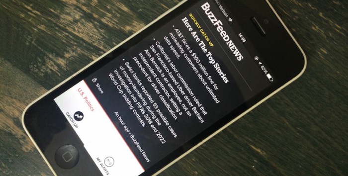
BuzzFeed has emphasized the newsletter since the earliest days of the app’s development. BuzzFeed editor-in-chief Ben Smith told us last July — before anyone was even hired for the app — that the newsletter would be a place to test out ideas and develop a tone for the app, and that’s been the case. The app’s Quickly Catch Up section developed out of a feature of the newsletter that emerged from a spur-of-the-moment Slack conversation between Tran and Laura Davis, another staffer working on the app. Similarly, the tone and editorial focus of the app were honed first in the newsletter. Certain stories in the app, for instance, have sections that offer more background or additional information, and that evolved from experiments BuzzFeed tried in the email.
“We always wanted to provide just a little extra — whether that meant pushing the story forward and having the reader anticipate what can be expected next or that could mean digging deeper and providing a little bit of background,” Tran said. “That could mean giving some opinion about it. We’ve tried different things all under this editorial hunch of providing a little extra, whatever that could mean. I think of it in terms of giving more access points, just giving more entry points into the story.”
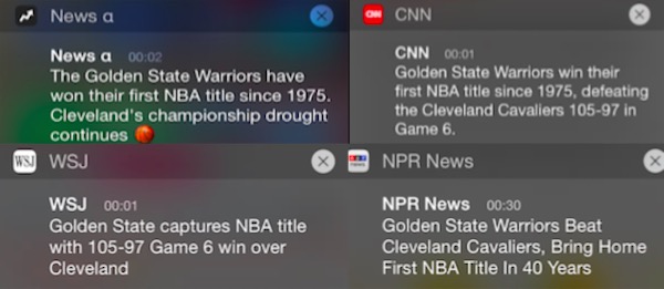
The focus on providing context has been a major talking point for BuzzFeed as its developed the app. Aside from adding background information in the main stream of the app, it has focused on contextualizing its push notifications as well. For instance, when the Golden State Warriors beat the Cleveland Cavaliers this week to win their first NBA title since 1975, BuzzFeed’s app notification noted that Cleveland had lost yet another championship, not only it was the Warrior’s first title in 40 years. (This being BuzzFeed, they also tend to use emoji in notifications and headlines.)

“It’s less about notifications as a platform,” Ishmael said. “What we’re trying to deliver is interestingness, and context, and background, and the feeling that you’re informed.”
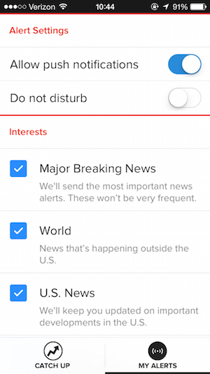
 Managing notifications is one of the app’s only two main sections. BuzzFeed gives you limited control over the topics about which you get notifications, and it also has a Do Not Disturb function that lets you set times when you don’t want to receive any notifications.
The app’s main screen is called Catch Up. The first thing you see on launch is the Quickly Catch Up module, and then the rest of the main stream of the app is a mix of stories from BuzzFeed and other outlets. And each element of the app — whether it’s from BuzzFeed or not — is shareable with an image highlighting main points of the story.
With the app launching today, BuzzFeed will continue to produce the newsletter alongside the app, though some of the editorial processes may change as Ishmael grows her team to provide round-the-clock news coverage by hiring additional staffers in London, Los Angeles, and New York.
Moving forward, BuzzFeed plans to update the app in two-week cycles, Ishmael said. Though she said there are plenty of features she wants to add, the short-term focus will be on adding features that let users follow certain stories (a version of this is already in the app; there’s a setting that lets you follow updates on the ongoing FIFA corruption investigations) and follow individual BuzzFeed writers.
“One of the hard things about app development is being really disciplined about what matters and what you think is important enough to spend your dev and your design time on and being really [committed] about sticking to that, and saying that in the next two weeks, we’re going to focus on this thing or after that we’re going to focus on this thing,” Ishmael said.