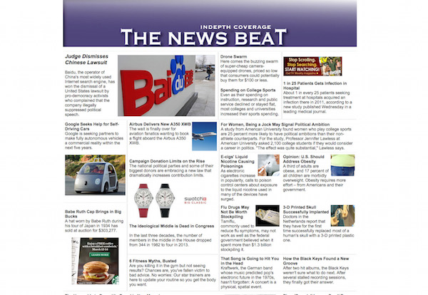
News sites with modular, image-heavy designs receive more pageviews and have stronger user engagement than sites with more staid, newspaper-inspired designs, according to a report released Tuesday by the Engaging News Project.
Modern, modular homepages received at least 90 percent more unique pageviews than traditional sites did, the study found.
Users viewing the modular homepage recalled details of the articles at least 50 percent more often than did those who viewed the classic homepage, according to the report.
“The way in which you design your homepage can have a big effect,” said Talia Stroud, the director of the Engaging News Project and a professor at the University of Texas.
Stroud and her co-authors — Alex Curry, Arielle Cardona, and Cynthia Peacock — created two fictional news sites with 20 evergreen news stories selected from actual publications. They ran three different studies that involved 2,671 participants, and in each case the modern-looking site received more pageviews.
User reaction to the sites was similar across the surveyed demographics of age, education level, political knowledge, and familiarity with the design of the sites. In two out of the three studies, users found that the modern-looking site was more “enjoyable, informative, credible, trustworthy, interesting, clear, and easy to navigate.”


In Study 1, 429 participants were required to stay on the site for 90 seconds before continuing with the study. The modern site received 813 unique pageviews, while the classic site received 427.
In the second and third studies, the researchers didn’t place any time restriction on how long users had to stay on the site. There were 405 participants in Study 2, and the contemporary site received 274 unique pageviews. The classic site had 93. In Study 3, the contemporary site attracted 254 unique pageviews from 332 users, compared to 105 for the traditional site.
“There are engaging pictures, and it’s a little bit more of an engaging layout,” Stroud said to explain why the contemporary site was better trafficked. “People aren’t as familiar with it, they find it interesting, they want to see how it works.”
Users also retained more information from stories presented on the contemporary homepage. They were asked to write down all the details they could remember from a handful of the stories on each site. In Study 1, viewers of the modern-looking site recalled 0.61 details, on average, from the stories, while classic site viewers recalled 0.37 details. In Study 2, users who saw the modern site remembered 0.43 details, compared to 0.18 details on average for those who saw the traditional site. The difference in the third study wasn’t statistically significant.
Conversely, when looking just at the homepage, users remembered more details on the classic homepage because that layout displayed the ledes from each story on the homepage. On the contemporary site, users had to scroll over the image to get the lede. The differences weren’t large, though, and the report “suggests that the learning implication of making the lede appear only when scrolling over the headline is minimal.”
In the third study, the researchers created a modified version of the classic site, in which articles expanded over the homepage once they were clicked instead of opening a new page. Between the classic and modified classic sites, there were no significant differences in how users clicked on stories, retained information, or perceived the sites. Users, however, still preferred the contemporary site to the modified classic site.
“It had the technical features of the contemporary site, but the look of the classic site to see if it was the technical features or the look and the layout [that made a difference],” Stroud said. “The result of that study showed it’s the look and the layout. It’s not the technical features.”
Despite the report’s findings, Stroud was quick to point out that the results were from mock news sites in a lab setting, not actual sites. Moving forward, Stroud said she’d like to work with a real news site throughout its redesign process to study how user behavior changes.
“It would be a dream if there was a news organization…that’s doing some sort of a homepage redesign and would be interested in collaborating with us beforehand to test it, and then have them roll it out and see if what we’re able to do in a lab, or online experiment setting, replicates with what happens when they actually launch the site,” Stroud said. “I think that would be really important and so helpful to news organizations.”
Ultimately though, Stroud emphasized, that news organizations would stand to benefit from studying user behavior as part of their redesign processes. The report’s authors highlighted The Guardian, The New York Times, and The Daily Beast as outlets that successfully explained recent design changes to their users and incorporated user feedback into their redesigns.“What this research adds is a starting point for how one might redesign a news homepage and a research method that could help to reveal whether a redesign will have a desired effect,” the report’s authors wrote.