The Wall Street Journal is not exactly known for its sense of whimsy — but that’s what the folks revamping its newsletter system are aiming for.
When Cory Schouten and Annemarie Dooling (formerly of CJR/Indianapolis Business Journal and Vox Media, respectively) joined the Journal’s newsletter team earlier this year, they embarked on the journey of whittling down the paper’s 126 newsletters. Some were automated but didn’t generate many clicks; others had a little more voice, but a pretty dry voice nonetheless.
That whittling has led to what are now around 40 streamlined, audience-driven emails. They can now feature market information updating in real time (even after a newsletter is sent), and coaxing non-payers toward a subscription is core to their mission and design. (This process began under product designer Cory Etzkorn three years ago and accelerated through a migration to the Campaign Monitor platform since last fall.)
“When we walked into it, they’d been added [one by one] over many years,” Etzkorn said. “One year a Life and Arts newsletter would get added, then Sports would get added, but a different team or person would lead the design or strategy. Over a decade, we had a portfolio of close to 50 newsletters that looked totally different. They didn’t all have the Wall Street Journal logo. Some were just autogenerated lists of links, others were more thoughtful. Some were really good. Some weren’t so good.”
He spearheaded the design team’s build of a modular newsletter structure as the decision was made not to re-license their previous email newsletter vendor. (They wouldn’t name names.) Dooling, who built newsletters at Racked and later Vox Media from the ground up (she shared her lessons learned here), came onboard as the product lead two months ago, while Schouten has been shaping the newsroom’s perspective on newsletters for the past five months as senior editor.“Because newsletters were an afterthought when I got here, there wasn’t really a system for what we were doing with these numbers — they were all being thrown at editors, engineers, everyone,” Dooling said. “I would look at the list and figure out: If these people aren’t clicking what are they doing with newsletter and what can we give them?”
The Journal, like other publications of its venerable stature, has been trying to find its way in the journalism world today — it slipped behind The New York Times and The Washington Post on scoops and Pulitzers under a rocky five years with a now-exited editor-in-chief. But the organization has also beefed up its digital strategy department and been experimenting with personalization, bendy paywalls, and now newsletters (they ditched blogs). Here are some of the ways they’ve tried to breathe new life into their emails.As the team has migrated newsletters over to the Campaign Monitor system, they’ve been able to evaluate if each newsletter is actually worth keeping or if they already moved an email that fit the audience of the migrating one. And instead of organizing newsletters by sections, as you’d see in the print paper (or even as delineated on WSJ.com), Dooling and Schouten are trying to coax the organization into centering newsletters on smaller topics or specific reporters. Previously “they were in silos,” Schouten said. “One of the things we’re focusing on strategically is the audience and what they’re looking for.”
When the Journal began publishing “Unprepared” earlier this summer — a series about how Baby Boomers are, well, less well prepared for retirement and aging compared to other generations — it wasn’t drawing big eyeballs. “We publish 200-something things a day and only 40 can fit on the homepage. Some things just aren’t going to get attention,” Dooling said.
To keep readers coming back to the series, the Journal introduced a small email nudge — Dooling described it as a hybrid of a newsletter and an alert — notifying opted-in readers whenever a new installment was published. Readers were encouraged to subscribe with an in-line prompt in the fourth paragraph: “(Be the first to read the latest installments in our coverage of the coming retirement crisis. Subscribe by email.)” It’s an easy lift, built a small but passionate audience, and doesn’t require the readers to commit to an email for the rest of their lives. And it also identifies readers who are drawn to reporting like this. Dooling and Schouten are still testing the concept, but it looks promising: More than 1,000 readers have signed up, and over half are opening the emails.
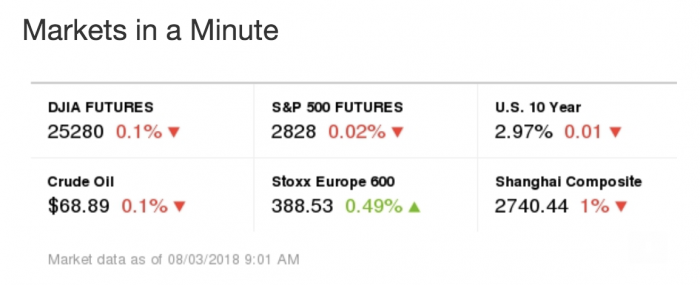
When I opened a recent Markets email newsletter, it showed me the market prices as of August 2 at 6:10 p.m. (the time I was checking it out) — even though it had arrived in my inbox on August 1 at 9:08 a.m. The stipple drawing atop the newsletter also changes based on the state of the market: bear or bull. These are some of the new modules built by Etzkorn and the design team. Even though they’re just a module loading an image, I thought it was nifty — and in Schouten’s dreamworld, a little whimsical. “One of the things we’re aiming for is to establish a sense of whimsy around what we do, which might sound silly coming from The Wall Street Journal,” he said. It’s that surprise-and-delight moment that helps readers know the market data even though they might be checking the newsletter hours after it’s sent.

Can whimsy be built into the newsletter system? The real-time feature is one module added to the Journal’s newsletter module library, so it can be tossed into other newsletters at a moment’s notice. “When we add a new component — say an embedded tweet for Life and Arts — that component is automatically available for the Politics newsletter and Capital Journal,” Etzkorn said. “When we improve one newsletter, they all improve at the same time.”
Plus, other editorial groups can use the modules to whip up a newsletter in a jiffy with minimum effort required from the product team. Dooling says each newsletter launch has three steps (beyond its initial construction): training editors on expectations and preparations, walking them through the development of an example newsletter, and then the blastoff itself.


Inviting readers to share their thoughts in a two-way exchange isn’t a new concept either, but not many publishers’ newsletters actually allow subscribers to easily contact their writers. Now, all migrated newsletters have a designated Journal editor in the reply-to field, and Dooling has been helping editors get the hang of managing the responses. “I’ve got 12 years of community managing experience. I always get questions about commenting platforms and that sort of thing, but it’s interesting how you can build community so much into email,” she said.
Non-subscribed visitors to WSJ.com now each receive a propensity score based on more than 60 signals, such as whether the reader is visiting for the first time, the operating system they’re using, the device they’re reading on, what they chose to click on, and their location (plus a whole host of other demographic info it infers from that location). Using machine learning to inform a more flexible paywall takes away guesswork around how many stories, or what kinds of stories, to let readers read for free, and whether readers will respond to hitting paywall by paying for access or simply leaving. (The Journal didn’t share additional details about the score, such as the exact range of numbers it could be. I asked what my personal score was; no luck there, since the scores are anonymized.)
“If we’re thinking about the newsletter that is for members only, what does the landing page look like? What’s the signup form? Does the whole experience feel premium? Does it feel like something special you get as a member?” Dooling said. To win over prospective subscribers, “it’s not enough to give them a cheaper version. It’s more about how can we show you the content we have for you in the best way possible without making it less of an experience.”
That also means measuring different newsletters differently; premium newsletters might focus more on open rate while free ones worry more about clickthroughs, for example. “Each newsletter ultimately has a role and a responsibility,” Schouten said.
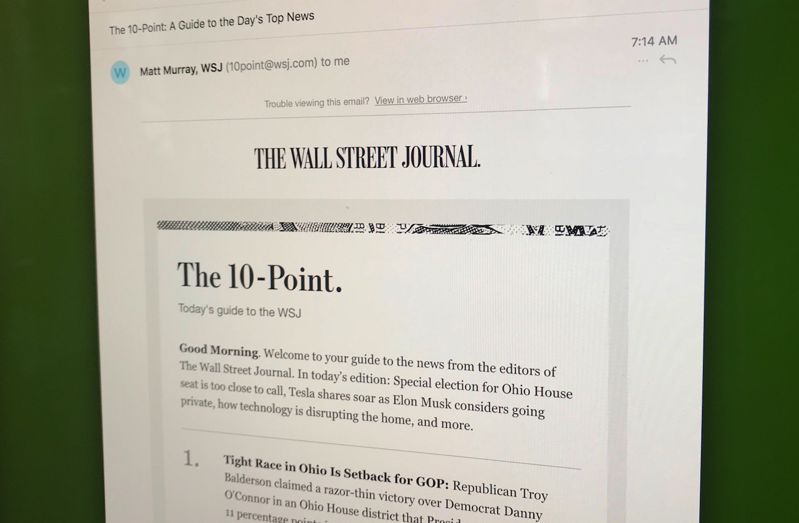
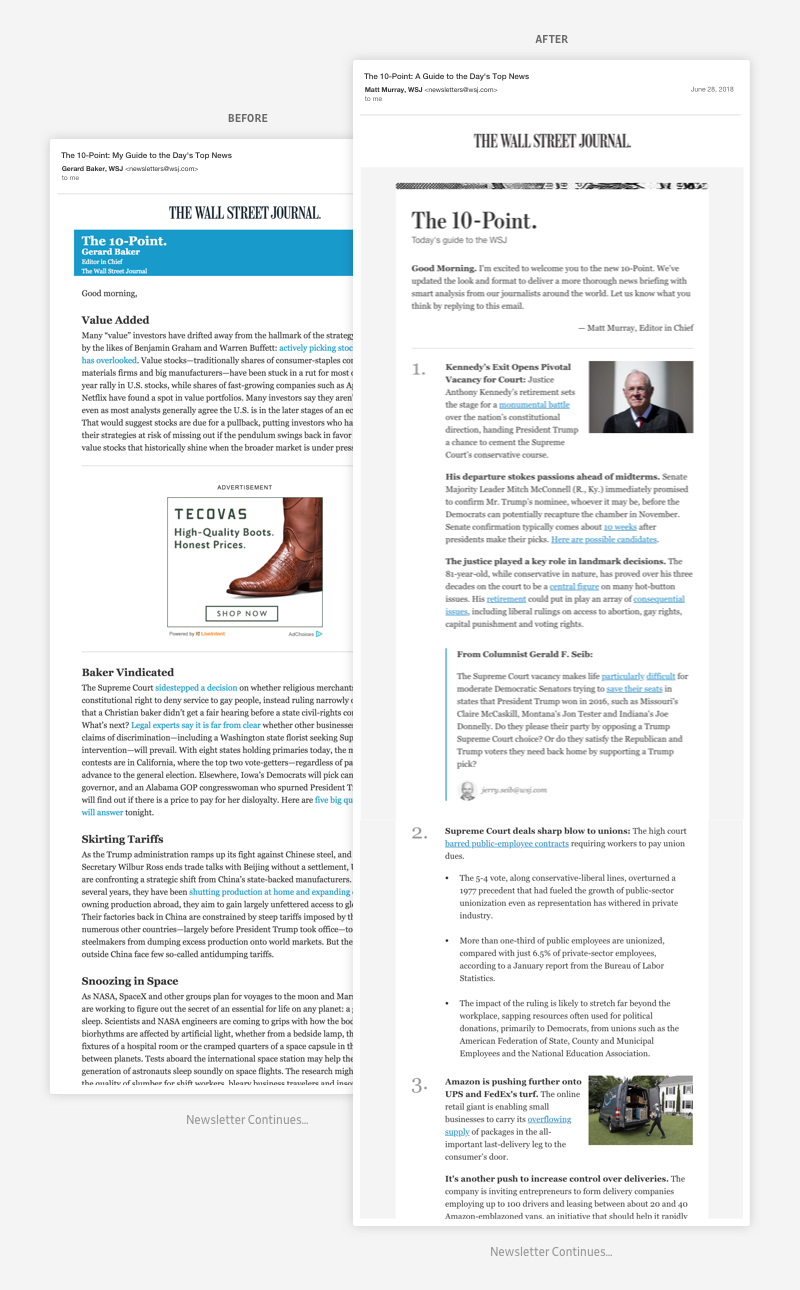
Flagged to readers as “a personal, guided tour to the best scoops and stories every day in The Wall Street Journal,” this newsletter is curated by the editor-in-chief in the style of the Journal’s (print) front-page What’s News column. Close media observers might remember that the Journal’s previous editor-in-chief, Gerard Baker, left the lead role in June, transitioning to editor-at-large, a weekend columnist, and host of a Journal-themed show at Fox Business Network. His successor, Matt Murray, quickly stepped in.
In two weeks, Dooling, Schouten, Etzkorn, and the rest of the newsletter brigade rebuilt the flagship newsletter. They broke up the blocks of text into 10 numbered points — stopping it from getting truncated in Gmail — and aimed for a briefer, more streamlined style so readers could better scan. (Plus, the 10th point, “Today’s Question and Answer,” shares the responses of readers to the previous day’s prompt.)
After the revamped version debuted, the team asked readers to share their thoughts and ran the “hundreds of responses” through IBM’s Watson, Schouten said; the prevailing sentiment: “joy.”
“The idea of a morning newsletter relaunching and generating joy is really exciting feedback to read,” he said.


Next on the trio’s list is taming the email lists of the legacy organization to maintain sender integrity (as few Promotions filters as possible!) and running the ideas like the series nudge and real-time modules through more tests over the next few months. Dooling also wants to take a step back and look at the user experience more broadly.
“The newsletter itself in your inbox is simply not enough,” she said. “What is it like to speak to the editor if you reply? What do you want to do with the information? What is the action involved when you get this newsletter?”
“We’re trying to innovate on a platform that hasn’t really innovated in a long time,” Etzkorn said.