 Yesterday, I wrote about a fascinating set of data I’d obtained with the help of the folks at PostRank: Every tweet generated from within The Daily iPad app from launch through March 31.
I used that data in yesterday’s piece to try to learn about the relative size of The Daily’s audience. And it showed that the number of tweets generated by the app’s users has been declining ever since launch — which would seem like an indicator that The Daily’s audience might not be growing as fast as some might like.
But the data’s much richer than that, and I’ve been spending the past few days digging into it to see what else might be of interest from a future-of-news perspective. So today I present three additional findings that try to answer these questions:
— Do people use iPad apps at different times of the day than they use other, non-tablet devices?
— What kinds of stories in The Daily get shared the most — or the least?
— Does the distribution of tweets among Daily stories or among Daily readers match a power-law distribution?
—

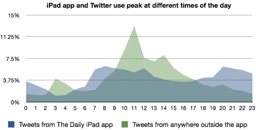
This might be my favorite chart from the data set. The blue line you see above shows the timing of tweets generated within The Daily’s iPad app, tied to hours of the day. So the x-axis starts, on the left, at midnight, the middle is noon, and the right side goes up to midnight the next day. (The time zone here is set to Eastern time, which is where The Daily’s based and where the largest chunk of its users are likely to be.)
The green line, in contrast, shows the timing of all tweets to thedaily.com that aren’t generated from within The Daily’s iPad app. So that would include anyone using the Twitter web interface, a mobile Twitter app, or a desktop app like TweetDeck. (Both lines show the share of each group’s tweets happening at that hour — not the raw totals.)
This actually approximates a broader device divide. All of the tweets represented in the blue line came from iPad use; the vast majority of tweets in the green line came from desktops, laptops, or smartphones. And notice how interesting the patterns are! The tweets from the iPad app peak in the morning (around the 7:00 and 8:00 hours) and again in the evening (around 8:00, 9:00, and 10:00). The non-iPad app tweets follow a very different pattern: They match up with the work day, highest from 9-to-5 and peaking just before and after lunch — in other words, when lots of people are sitting at a desk looking at a computer.
Within the app, The Daily’s pattern looks an awful lot like the old newspaper consumption pattern: in the morning before work and in the evenings after it. (There used to be this thing called an afternoon newspaper, see.) It also looks a lot like what Read It Later found in the usage of its iPad app, which was similarly bimodal. (Although their data was more slanted toward the evening — it makes sense that The Daily, which is published early each morning, would be relatively stronger in the a.m.)
The non-app Twitter traffic, meanwhile, matches up well with the work that Pablo Boczkowski has done (in News at Work and elsewhere) on how the shift to consuming journalism in an office environment might be impacting the field.
I can’t say how, exactly, but it’s increasingly clear that a successful tablet news app will need to somehow be optimized for a leisurely, at-home, lean-back environment.
—
The Daily does a good job of making the section each story is in clear from its URL. In other words, it’s clear that
http://www.thedaily.com/page/2010/12/12/020411-arts-beavis-butthead/
http://www.thedaily.com/page/2011/01/01/031111-news-tsunami-video/
and
http://www.thedaily.com/page/2011/02/01/020211-sports-wolken-1/
are in the Arts & Life, News, and Sports sections, respectively. With that in mind, I wanted to find out what types of stories were most likely to be shared via Twitter — the flashy Gossip section, the image-heavy Sports section, or something else entirely?
I determined the section for all 6,024 tweets generated from within The Daily’s app that linked to a story page. Most I could determine quickly from the URL; a few hundred I had to determine manually for myself. Here are the results for each of The Daily’s seven sections:
News: 3,427 tweets (56.9 percent of all in-app tweets)
Business: 33 tweets (0.5 percent of all in-app tweets)
Gossip: 289 tweets (4.8 percent of all in-app tweets)
Opinion: 719 tweets (11.9 percent of all in-app tweets)
Arts & Life: 559 tweets (9.3 percent of all in-app tweets)
Apps & Games: 630 tweets (10.5 percent of all in-app tweets)
Sports: 367 tweets (6.1 percent of all in-app tweets)
So The Daily’s News section accounts for an absolute majority of the tweets sent from the app, while the Business section is almost invisible to Twitter.
Of course, there’s not an equivalent amount of material to tweet in each section — News is a lot bigger than Opinion, for instance. So for the past three days, I’ve been counting by hand the number of story pages in each section. (I would have liked to have a larger sample, but The Daily doesn’t do archives. And note this is horizontal-swiping story pages, not stories. Many stories have more than one page; many pages have more than one story. The story page is what the tweet button in the app uses to generate the link URL.)
Here’s my count of the total number of pages by section since Monday:
News: 101 pages (32.3 percent of story pages)
Business: 17 pages (5.4 percent of story pages)
Gossip: 24 pages (7.7 percent of story pages)
Opinion: 27 pages (8.6 percent of story pages)
Arts & Life: 28 pages (8.9 percent of story pages)
Apps & Games: 31 pages (10.0 percent of story pages)
Sports: 85 pages (27.2 percent of story pages)
Interesting! So — assuming that this section breakdown has been largely constant through The Daily’s two-month run — the News section is generating 57 percent of the tweets with only 32 percent of the content. Meanwhile, Sports takes up 27 percent of the content but generates only 6 percent of the tweets. I don’t know that there are any larger conclusions to be drawn here, but the wide variation sure is interesting.
—
Anyone who’s hung around the Internet has heard of the long tail, a.k.a. the Pareto principle or a power law. (Those aren’t strictly interchangeable, but they’re often tossed around as if they were.) For example, in the music business, a few blockbuster albums and songs have usually made a huge portion of the industry’s profits, while a huge number of other albums and songs barely sell at all — the long tail.
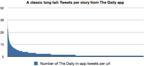
When I started crunching the numbers, I saw two nearly perfect cases of this kind of distribution. First, I looked at which Daily articles were tweeted the most within the app. A total of 2,139 unique URLs were tweeted at least once. I ranked them from most- to least-tweeted and this chart is the result:

That’s basically a perfect power-law distribution. A few of the most-tweeted stories on the left get (relatively) huge amounts of attention, while nearly half of all tweeted URLs — the long tail — were tweeted only once. (And, of course, many were never tweeted at all.)
In case you’re wondering, here are the 10 most-tweeted stories by Daily app users:
1. The introductory “welcome to The Daily” editorial from Feb. 2, launch day: 52 tweets
2. A video story of a winter storm, also from Feb. 2: 37 tweets
3. A nine-sentence story on a Catholic confession app from Feb. 8: 36 tweets
4. A six-way tie between a review of Portlandia (Feb. 2), an Egypt infographic (Feb. 2), a two-graf gossip piece on an NBC firing (Feb. 5), a piece on new Army social media guidelines (Feb. 6), a tsunami video (March 14), and a Japan relief appeal (March 16): 30 tweets each.
10. “American military commanders have declared war on pets,” Feb. 13: 29 tweets
You’ll note that four of the top 10 are from launch day, three others are from the first week, and only two are from the past month.
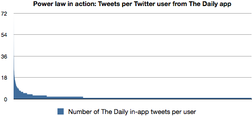
The other long tail to pop out from the data came when I wanted to see how many tweets each Daily user was generating. I gathered up anyone who tweeted at least once from the app, then sorted them by how many times they’d tweeted — most on the left, least on the right. Here are the results:

As you can see, a very similar result: A few users tweet a lot, but most — just over 70 percent in this sample — tweeted only once from the app.
The most frequent Daily twitterer is @amadorn (“We buy and sell vintage and contemporary costume jewelry”) with 71 tweets from The Daily app over the two-month period. Nine other Twitter users tweeted more than 20; another 34 tweeted more than 10. In total, 3,316 people tweeted from the app.
I’m not done mining this data quite yet — there are still some interesting nuggets to share. Like: What can we learn about the people who use The Daily from their Twitter bios? Where are they tweeting from? How does in-app tweeting differ from out-of-app tweeting? More to come.