
Editor’s note: ProPublica’s been a persistent innovator on driving crowd participation in journalism projects. (We’ve been writing about it for years.) A big part of crowdsourcing is design — how best to encourage user behavior that will contribute to the project’s goals. Here, Al Shaw, in a piece written for ProPublica, describes how his team designs for engagement. (Al presented on casino-driven design at NICAR recently; here are his slides, which include a few points not in his piece.)
 During the 2012 election, we created Free the Files, an interactive news application based on crowdsourced data, built in real time by thousands of volunteers. It was a collaborative effort to track TV ad spending by campaigns, super PACs and so-called “dark money” nonprofit groups in the country’s top swing markets.
Measured by participation rate, Free the Files was an astonishing success. More than 1,000 contributors submitted over 94,000 transcriptions to help turn messy invoices from local TV networks into clean data. One volunteer transcribed over 28,000 filings. Each transcription was “verified” after two or more users agreed on all of its data points. There are currently around 17,000 verified filings, and people are still working.
Much of this success came from the efforts of our expert engagement team, who motivated and interacted with our volunteers every day, and who hatched a clever campaign of social media, contests and promises of free T-shirts. Our users were, of course, also motivated by their own sense of civic responsibility, wanting to help build the first free database of political TV ad spending.
But design played a significant role as well. We kept our eye on optimizing each page for participation. We called the design we devised for participation-oriented areas of the site “casino-driven design.” A variant of behavior design, casino-driven design cuts away all distraction and drives the user’s attention toward staying focused on a single task.
Why do we call it casino-driven design? Casinos are notorious for adopting an interior design that keeps people gambling. There are no windows and no clocks, so it’s easy to lose track of how long one has been gambling.
Casino-driven design creates an optimal atmosphere for task completion by actively discouraging cross-site exploration and page exits. And, like in a real casino, we keep the small rewards flowing, such as seeing your name on “freed file” pages and on a leaderboard.
There are no site-wide template elements on casino-driven pages — no section links, ads or even a link to the homepage. Casino-driven pages start out as a blank white page. We add only the elements necessary for users to understand where they are and the nature of the next task. The only way off the page is to complete the task or abandon it.
But there’s more to casino-driven design than just a clean page.
There are two important goals in getting people to complete crowdsourcing tasks: getting them to start volunteering and getting them to keep going.
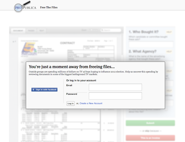
We tried out a bunch of strategies for getting people into the app for the first time, but our favorite was the “glass door”: We show a tantalizing taste of the activities that will become available after a user takes the first step — signing up:

Behind the “frosted glass” is a view of what you’ll be able to do once you’ve logged in. It’s hard to get to that screen and not want to see what’s behind it.
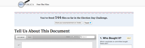
We also helped our readers find an activity using yellow and blue wayfinding at the top of each page:

Yellow status bars across all of our apps mean “this stuff is about you.” In Free the Files, we used it to give people quick links to logging in, an at-a-glance look at how many files they’ve freed, and what’s coming up. Light blue boxes and bars across our apps mean “here’s the most important thing you can do” (we call this shade of blue “do-something blue”). When we launched an election-day contest to transcribe all the files in Las Vegas, we put a blue bar on top of the pages to let them know there was an important activity to take part in. By the end of the single-day Las Vegas challenge, we had transcribed every file in the market.
Once inside, we keep the click targets really big and bright, and the number of actions as low as we can get away with. We spent a long time editing down the number of data elements we asked our readers to help us transcribe. In the end we pared down to four elements — and after launch we found ways to cut that down even lower. Once the user has transcribed a document, he or she can mash the big green or red button. Quite satisfying!

To keep people around longer, we engineered the page never to fully reload. There was never a reason for people to leave the page — we provided pop-up instructions and autocomplete boxes for values we thought users may type in. For example, we preloaded the “Who bought it” autocomplete field with committee names from both the FEC’s database and the FCC’s file naming scheme, so users could start typing and choose one rather than try to decode the often confusing forms.
Finally, we borrowed a trick from the gaming world by adding a leaderboard so that users could (justifiably) brag about how much they were contributing. They became super-competitive about their spot on the board. During the election-day challenge, we showed users their single-day count right in the yellow bar on each page to help them keep track of their score. Users were also able to brag in social media about freeing files — in a popup, without leaving the casino.

Casino-driven design was resoundingly successful in our election-related apps. We later used it to help drive participation in our Message Machine project. We’re excited to keep evolving it when we build crowdsourcing apps.
Casino-driven design is all about reducing friction to participation. We showed Free the Files to some MIT computer science profs and they gave us some interesting ideas we’re eager to try in future casinos.
One of the things that made transcribing the ad contracts difficult was that there were a plethora of proprietary page layouts that each station or network of stations used. This meant that users had to hunt around for the same data points in different places on different filings. It’s possible to cluster similar-looking documents using a technology called computer vision and then only show one kind of page to each user. That ought to speed their work up.
We also plan to experiment with presenting users with a single task — say, transcribing just the date on a single form design — and repeating the task over and over again. This may let the unconscious mind take over and speed task completion enormously. Different users would see different elements to transcribe, so we’d still end up with the same data, just split up more atomically.
Beyond that, we could also ask users simply to draw boxes around the spot where each data point can be found in these various formats and then write software to look in those places and use OCR to transcribe what it finds. OCR isn’t a good fit for analyzing entire documents like in Free the Files (especially scanned or faxed pages), but if we have human help to guide the OCR on these boxes, we may eventually be able to grab data out of forms with only human verification.
Poker hand photo by Alessandro Cani used under a Creative Commons license.