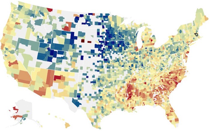
When you’re writing about how place — be that a neighborhood or a city — affects a child’s chances of getting out of poverty, location is obviously central to the story. So when the team at The Upshot wanted to put together a companion interactive piece, they set out to answer the question many readers would ask: What does that look like where I live?
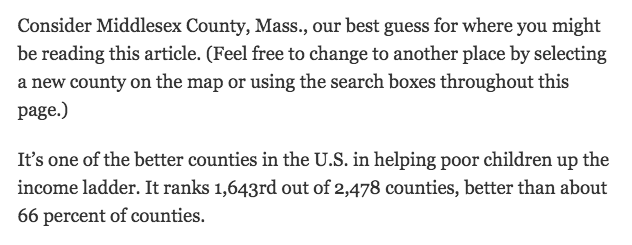
The Best and Worst Places to Grow Up has all the characteristics of other features from The New York Times’ data-and-analysis vertical: clear and concise data visualizations designed to add context and understanding. But what’s different is that the article itself is almost self-aware: It knows what county you’re in and alters the story text depending on your location. Browsing on your phone in Minneapolis, you get Hennepin County, Minnesota. Reading at work in San Antonio, it’s Bexar County, Texas. Pulling up the interactive here at the Lab, you get Middlesex County, Massachusetts:

Stats in this article customized to your reading location. Great idea @UpshotNYT! http://t.co/xRXzikFPrP Best and Worst Places to Grow Up.
— David Rapson (@rapsonenergy) May 4, 2015
The interactive is based off data from a new study by Harvard economists Raj Chetty and Nathaniel Hendren that explores how community can influence a child’s future income. The authors found that a child’s chances of stepping out of poverty can improve depending on where they are raised.
Gregor Aisch, a graphics editor at the Times, told me they decided to use readers’ IP addresses to get a rough sense of their location. (Readers can also opt to tell the Times their location when prompted by their browser of choice, he said.) And why do it? Times graphics editor Amanda Cox said they wanted to cut out the unnecessary steps between readers and the information they want.
“It’s a fine line between a smarter default and being creepy,” she said.
As a practical matter, Aisch said asking readers to supply information can sometimes cut down on their desire to use a news app. Past projects have shown that asking people to enter their Zip code automatically guarantees that a large chunk of people won’t use it, he said. Using geolocation is “a way to ensure that everyone gets their location version whether they want it or not,” he said. (The Times used MaxMind’s GeoIP product.)
Once you have the data, you need to translate it into something useful to users. The Upshot team decided to use prose templates that could be rewritten by a bot based on the data specific to where you live and your neighboring counties. Sharp-eyed readers can see the changes on the page if you enter another county while reading the story.For example, here’s my hometown:

And here’s where I live today:

In this case, most of the templates are similarly written in a style almost reminiscent of Mad Libs, with the bot swapping in data determined by a readers location. Still, there is some flexibility, the story structure allows for optional sentences that provide more specific insight into an individual county, Cox said. She estimates there are about 20 different variations on the story.