What happened inside the Pulse nightclub in Orlando in the early hours last Sunday when a gunman entered, shooting and killing 49 people and injuring dozens of others? The story unfolded quickly and in surprising directions. Accounts from survivors were harrowing, but the timeline of actual events was still hazy.
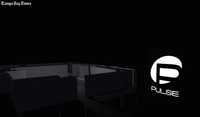
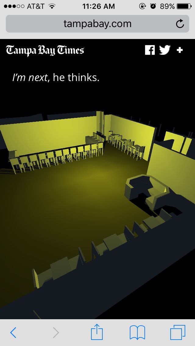
To allow readers to grasp the horror of that night — and the split-second decisions and sheer chance that lead to some losing their lives and others surviving — The Tampa Bay Times produced a mobile-friendly 3D interactive that shows various angles inside Pulse and allows readers to click through a series of accounts from inside the club. Click or tap, and the narrative proceeds through areas on the map of the club, through bathrooms, the dance floor, and doorways, following specific people. Here’s an excerpt:
Many praised the piece for its restraint, and while the interactive was a stripped down, soundless experience with a spare accompanying narrative that used basic colors to signal different accounts, it was far from simple to build — 21 people, from developers to designers to reporters, are credited on the piece.
 “After the first couple of days, we were trying to figure out concretely what happened during those three hours in the club. And we weren’t getting a lot from police or other official sources,” Nathaniel Lash, a Tampa Bay Times data reporter, said. “We initially just wanted to be able to do a basic explainer graphic — what happened where, when it happened.”
By Monday after the shooting, the Times had gotten floor plans for the nightclub. Eli Murray, a news apps developer, and designer and developer Eli Zhang, loaded the map into a 3D rendering software, which Times staffers had never used before. By Tuesday, official sources of information still proved insufficient, but the team realized just how many stories Times journalists reporting from Orlando had already collected and decided to piece together a narrative using the 3D floor plan. Neither the written script nor the interactive came first — the eventual written narrative, by Alexandra Zayas and Michael LaForgia and the interactive component developed simultaneously.
“To make this effective, we needed to know where people were at that time, where they were going, how they were making these split-second choices,” Lash told me. “Reporters had maps that we gave them, either printed out or in their emails. They were talking to people, and literally putting people on the map exactly where things were happening. We were able to nail down where people had gone, were going.”
“We worked with a three.js library, which we were also still learning and experimenting with. We hadn’t ever used three.js before and spent a lot of time figuring out all the background things you have to have for a story like this, and at the same time, reporters were feeding us pieces of the narrative,” Murray said. “During the whole process, we were working on tech as reporting was coming in.”
 The team grappled with complexity on both the technical and editorial sides. Would the piece be too showy? Was it insensitive? Did it feel like a video game rather than a work of journalism?
“We were trying to find a balance between a sterile and static map of the club, while not making it look like a video game of a tragic event,” Murray said. “There were a lot of little design tweaks. I wouldn’t say we scrapped anything, but we had to experiment.”
The team decided against music, for instance — “we thought it would push this into a realm that was too real and also not real at the same time — that uncanny valley” — and focused on single points of light to highlight each individual’s story.
The interactive was also always intended from the beginning to be a desktop and mobile experience (though a little bit of trigonometric wrangling was required to make sure the dimensions of the room displayed properly).
“We rarely conceive of things that fundamentally don’t work on mobile. Even while we were learning the library, we were always going to make something that worked on mobile,” Murray said. “Our designer Martin Frobisher, who also worked on this, is the guy who often is saying, ‘Hey, this doesn’t work on mobile, this doesn’t look right on mobile.’ We’re lucky to have that expertise, and to make sure someone is always bringing that to the forefront of our thinking.”
“We definitely hit a point the night before where the tech was working and everything was written, but the piece still didn’t feel right,” Lash said. “That’s when Eli — and Eli Z. — went in and figured out how to use the camera perspectives a little more creatively, which really helped.” (Lash said he’d initially been resistant to presenting a tight angle on specific areas of the club, because a bird’s-eye-view felt like a subtler approach.)
“Our team has a tradition with these sorts of projects. We lean more towards the storytelling side of graphics. There was definitely a decision where we could’ve maybe had all these points on a map and people could just hover over them to read. It would be the same words, but it would be less impactful,” Lash added.