
Apple announced its much-anticipated premium news service today. It’s called…Apple News Plus? Apple News+? News+ seems to be the official branding (a shift that began in iOS 12.2 beta 4), but the character doesn’t show up on most non-Apple devices, so let’s go with Apple News+. (Ugh, that “+.” is ugly+. Make it Apple News Plus.) You can watch the keynote here; the Apple News part starts about 6:30 in.
I’m disappointed, I have to say, though that may just be a case of my hopes being too high. Apple News Plus is based on Texture, the Hulu-for-magazines app that Apple bought last year. And “based on” is probably an understatement; it’s pretty much Texture squeezed into the Apple News interface. Texture isn’t bad! I’m a happy paying user, and it does some things well. But Texture’s origin story also limits what this important new product can accomplish. As I predicted last week:
I think we need to get more comfortable with the fact that the paid Apple News reveal next week is going to be super disappointing. The more we learn about it, the more it looks like a thin revision of Texture. https://t.co/MdS63ItDUU
— Joshua Benton (@jbenton) March 19, 2019
First, let’s go over the basics:
Again, it’s a fine product, just as Texture was a fine product. And obviously, being pitched as an upsell inside an app that 85 million people use monthly will convert a lot more subscriptions than something called “Texture” that the average iPhone user has never heard of. (The most pertinent quote from the whole event was Oprah detailing her reason for wanting to work with Apple on TV projects: “They’re in a billion pockets, y’all. A billion pockets.“)
But there are no companies with greater capacity to do good for both the news industry and the state of news consumption than Apple and Google. They control the operating systems that we spend countless hours staring at and getting information from. When Google decides to show users more news, it works — fast and at scale. When Apple decides to make a News app, it drives a lot of news to people who wouldn’t otherwise have seen it. And because Apple’s customers are the most attractive for news organizations — they on average have more money and consume more news — what they do with paid content matters even more.
Here are my biggest disappointments with today’s announcements.
Go watch the keynote and tell me that non-magazine content doesn’t feel shoehorned in. We see zero images of what the digital outlets will actually look like in the app; the newspapers get the barest mention. This is Lauren Kern’s editor’s note for Apple News Plus, which is all about the glory of glossy periodicals:
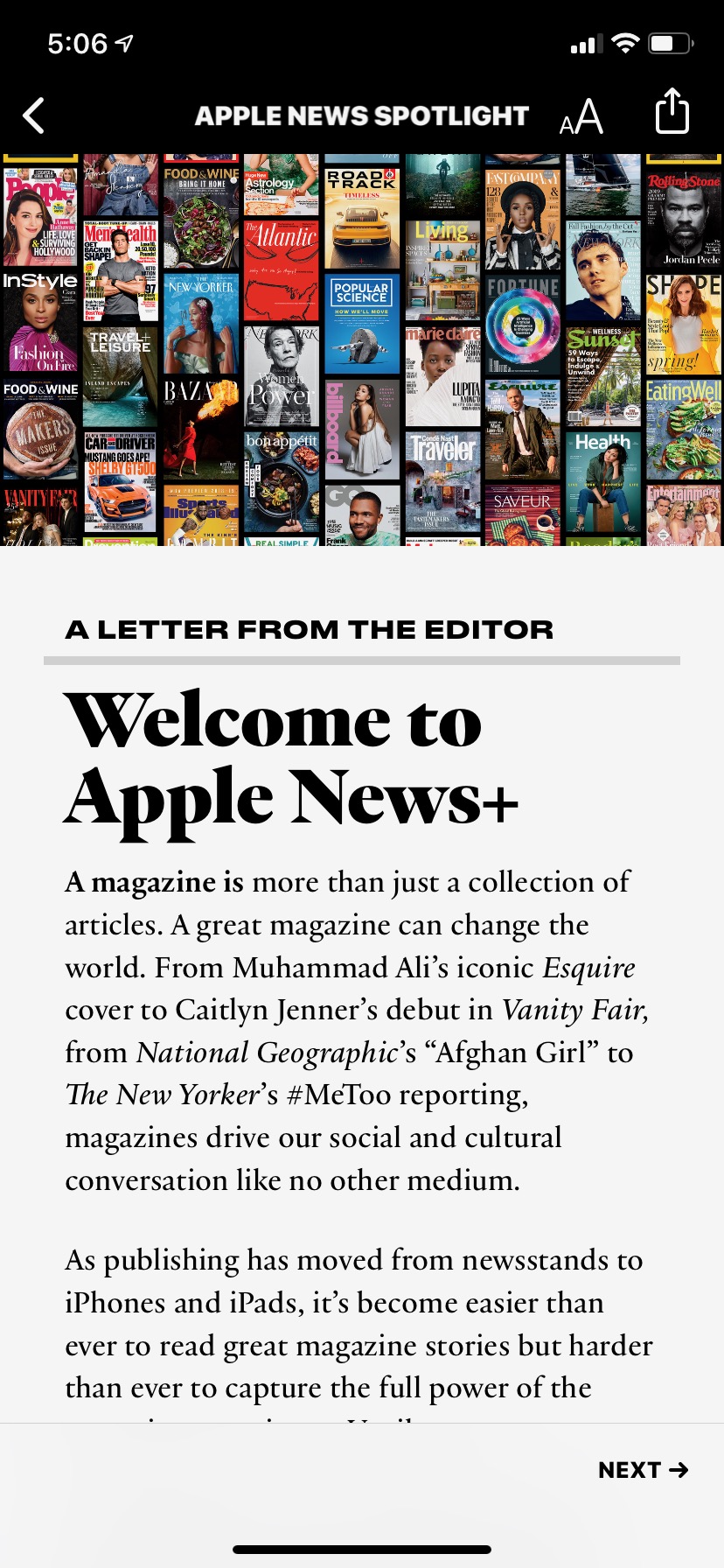
It’s just a little odd to see The Wall Street Journal (mentioned briefly on the next screen) presented as a side dish. Apple’s marketing presents Plus as having “built-in subscriptions to The Wall Street Journal and the Los Angeles Times,” but doesn’t foreground the fact that you’re only getting a “curated collection of general interest news” from the Journal. (Looking at the L.A. Times in Apple News Plus, it appears to offer pretty much all of its stories.)
It’s actually a little hard to even find L.A. Times and Journal content in Apple News Plus because they don’t fit into the magazine UX it’s dependent on. Tap “Browse the Catalog” in Plus and you can scroll all day, but you’ll never find either paper, because they’re not contained in “issues.” Want to see some Journal stories? Head to the Plus tab, scroll past the nav buttons, past the “My Magazines” carousel, past the “First Look” section, past a curated sports section called “Keeping Score,” and you’ll see four Journal stories. Tap on one of them, then tap on the logo at the top of the article page, and you’re finally at the Journal “built-in subscription” you paid for.
And the L.A. Times? Scroll past everything you saw on your way to the Journal, then a “New Issue” module, then a “Queens of Comedy” feature on Amy Pohler and Maya Rudolph, then a “Health” section, then “Inside Politics,” then “Breakthroughs,” and then you’ll see “From the L.A. Times.” (As I type this, the most recent story listed is 15 hours old.) Tap an article, tap the logo at the top of the article page, and you’re there.
How about the digital offerings — Vox’s The Highlight, New York’s verticals, TechCrunch, and The Skimm? How do you find them? No, seriously, how do you? I’ve looked and I can’t find them anywhere in the Plus tab, which has no search function and whose browse section is, again, limited to magazines. (I did find The Cut under “Style & Beauty,” but there’s no Grub Street under “Food” or Vulture under “Entertainment.” I found Extra Crunch in the non-Plus part of Apple News, but not in Plus.)
I’m not saying all this to complain about the UX, which is something that can be fixed. I’m pointing it out because it shows how tacked-on the non-Texture parts of the app are. It’s a thin and mostly hidden coat of news over what is overwhelmingly a monthly magazine product. Speaking of which…
Texture was built by a consortium of magazine companies (Condé Nast, Hearst, Meredith, Time Inc.), originally under the name Next Issue. It was meant as a way for those magazine giants to make sure that they would be able to control the means of distribution for their products and not let a tech giant like Apple take charge of it.
(So what did that consortium of magazine companies do with the independent distribution platform they’d spent a decade building? They sold it to Apple, of course. Sometimes you just need cash.)
But no matter how much Apple’s aesthetic epigenetics have contributed to Apple News Plus, the underlying magazine industry DNA is very clear — and not to the product’s benefit. Magazine companies produce issues; it’s what they did for many pre-digital decades, and it’s the frame through which they have typically viewed the transition to digital, usually to their detriment.
But even for magazines, only a relatively small share of the work they produce today finds its way into an issue. Take The New Yorker, which produces 47 issues of the magazine each year — but which can publish 47 digital-only stories over just a couple days. (If you want to read those in Apple News Plus, you get thrown out into a web browser, where you get the standard New Yorker paywall. Your “subscription” only goes so far.) Or Vanity Fair, a monthly magazine that has published 22 online-only stories including the word “Mueller” in the last week alone. Magazine companies wanted to sell issues — what unbundled industry has ever enjoyed the unbundling? — so that’s what Apple is hocking today.
Texture currently gives you the contents of The New Yorker print magazine, for instance, but nothing from https://t.co/O9CLL4D92J. Same for every other mag. An "issue"-based product has business appeal but limited user appeal.
— Joshua Benton (@jbenton) December 12, 2018
Texture was born in a uniquely dumb moment for the news industry — the short window of time, circa 2009-11, when people thought the iPad was going to change everything. Tablets, not phones, had publishers’ attention in that period, much to their later chagrin. Steve Jobs announced the iPad on January 27, 2010, but the magazine industry had been making excited tablet prototypes for some time already; here’s a Sports Illustrated concept video from 2009:
(“I think it’s really, really stupid,” Steve Jobs reportedly said about SI’s prototype, despite the fact it looked a lot like just about every other magazine iPad app since. He might not have meant it.)
Here’s one from the Swedish media house Bonnier (which owns more than 100 magazines, including Popular Science, Field & Stream, Saveur, Motorcyclist, Popular Photography, and the Scandinavian editions of National Geographic):
And though it took another year to launch, there was Rupert Murdoch’s The Daily, the iPad-only tabloid newspaper with “very big” ambitions — and a lifespan of less than two years. (Yes, young people, there was something digital called The Daily before Michael Barbaro.)
If you ever rewatch the documentary Page One: Inside the New York Times (mostly filmed in 2010, released in 2011), there’s an entire section focused on the iPad as journalism’s savior, while smartphones get barely a glancing mention.
Why all the publisher hype around tablets? The reasons were many: It would be a “do-over” of the first round of mobile disruption. That big screen would allow more immersive experiences. It’s hard to remember now, but mobile data was slow 3G garbage back then; “here’s a huge PDF-like thing that you can download at home on your wifi” wasn’t that crazy an idea. And, above all, publishers were already used to producing content formatted into rectangles about the size of a piece of paper. It’s what they did!
It was a bad bet. Tablets have never risen much above 7 or 8 percent of all U.S. web traffic. Meanwhile, phones now generate the majority of web traffic at most American and European news sites.
But it was in this moment of irrational tablet excitement that those magazine publishers joined forces to make what would become Texture. It was initially for tablets only; an iPhone version didn’t arrive until late 2013. And even then, Texture remained completely optimized for tablets — for magazine-sized pages, rendered in PDF, and shrunken to the phone screen in your hand. Some publishers made versions of their “issues” that could look okay on a phone, but most were content to turn the greatest content-consumption device created by mankind into a janky version of Adobe Reader.
I was a skeptic of Texture at first because I had tried it out on my iPhone:
Next Issue is now @Texture. https://t.co/bonj85WUqD It’s like a Netflix-for-subscriber-flyout-cards.
— Joshua Benton (@jbenton) October 1, 2015
But when I got a nice big iPad Pro a couple of years ago, it clicked for me. Despite a few hiccups, reading magazine issues on a big iPad in Texture is actually a pleasant experience, one I’ve been happy to pay for.
Apple buys @texture, an app and idea I found completely unappealing and kinda silly until I got an iPad Pro; probably use it 3-5x/week now https://t.co/u4tuROfMtq
— Joshua Benton (@jbenton) March 12, 2018
Will weekly or monthly content dumps be interesting on a phone? That's hard. Texture is awful on iPhones but actually quite nice on an iPad. But the newsier content gets, the more it gets pulled from tablets to phones. Tough balance to navigate.
— Joshua Benton (@jbenton) December 12, 2018
Apple’s presentation today leaned into the idea that Plus would work well on an iPhone (the device most of its demos were done on) and showed off nicely custom article formats. But Texture already has those — just very unevenly. Did Apple convince the publishers of hundreds of magazines to suddenly stop exporting PDFs that are hard to read on phones?
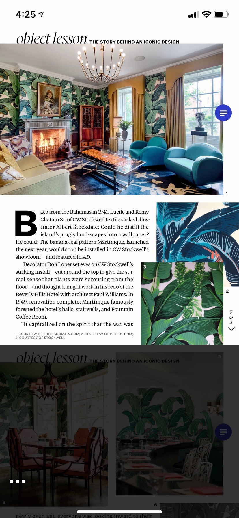
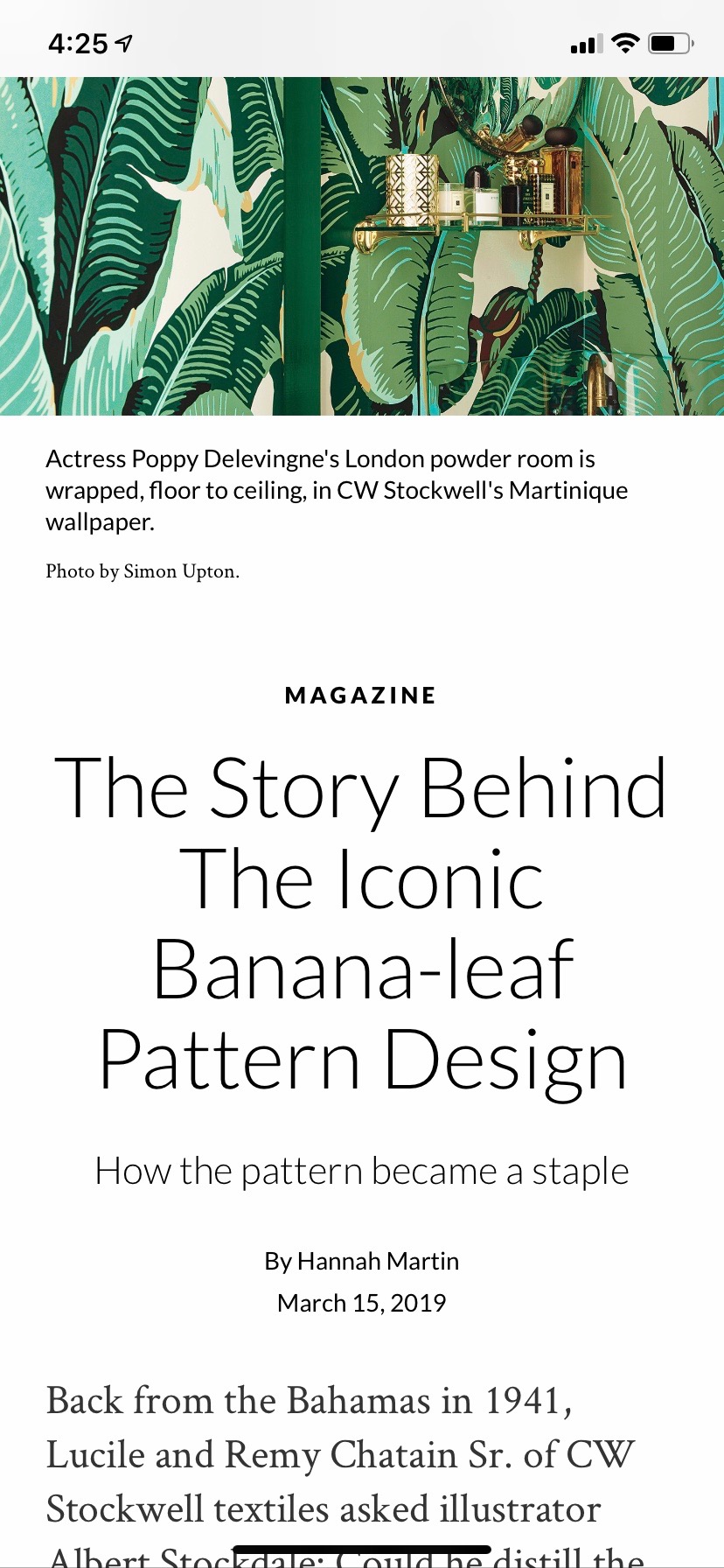
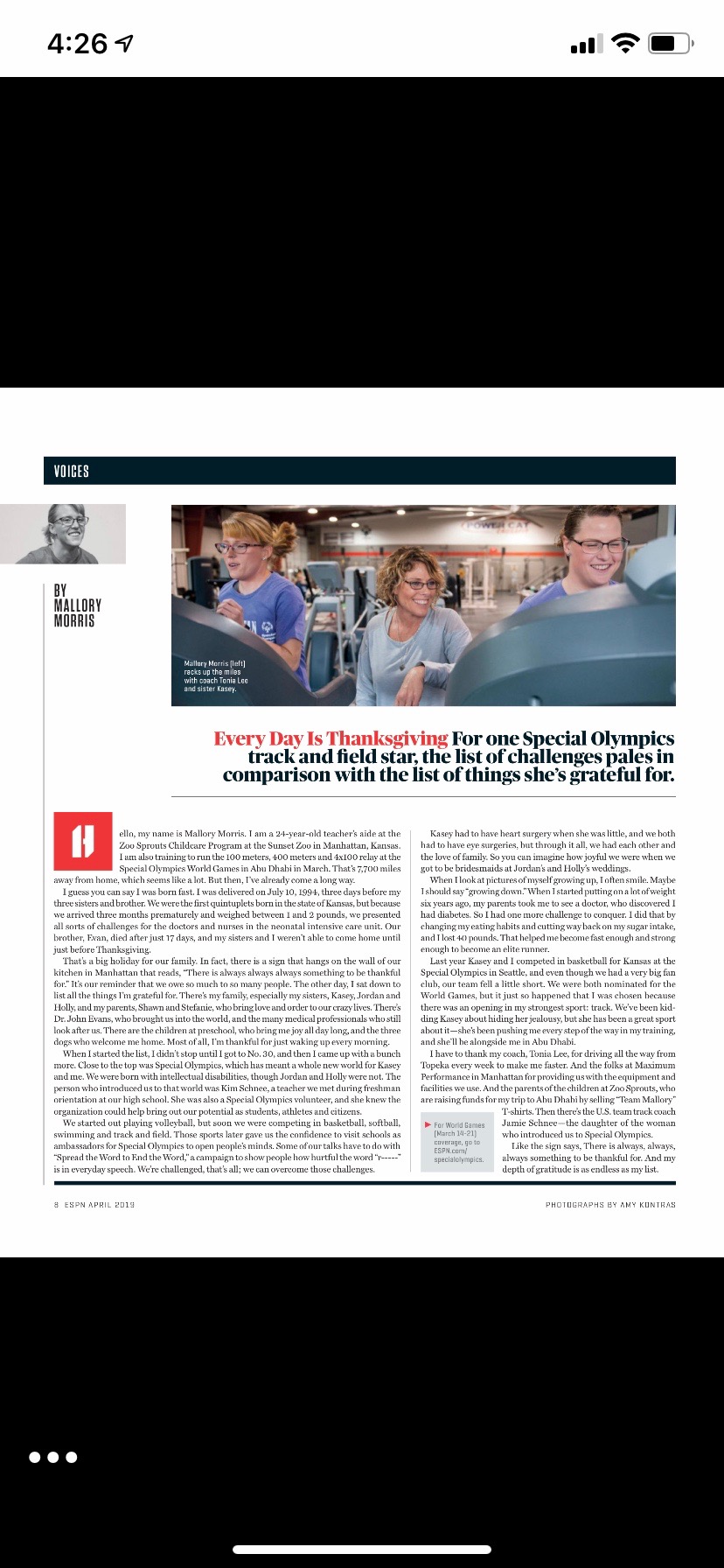
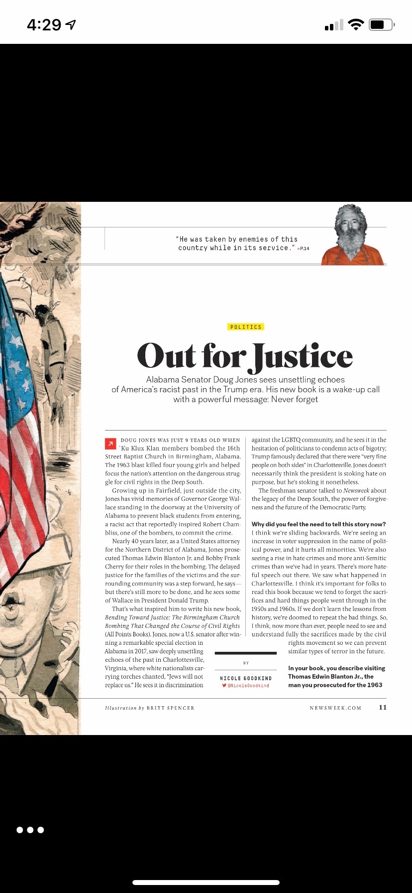
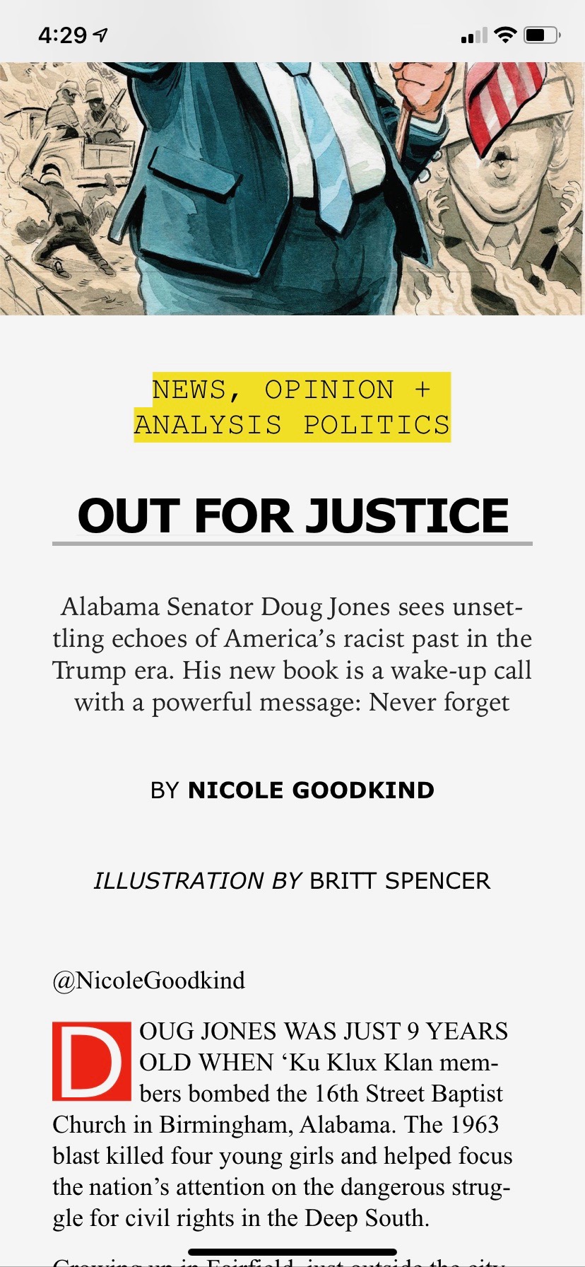
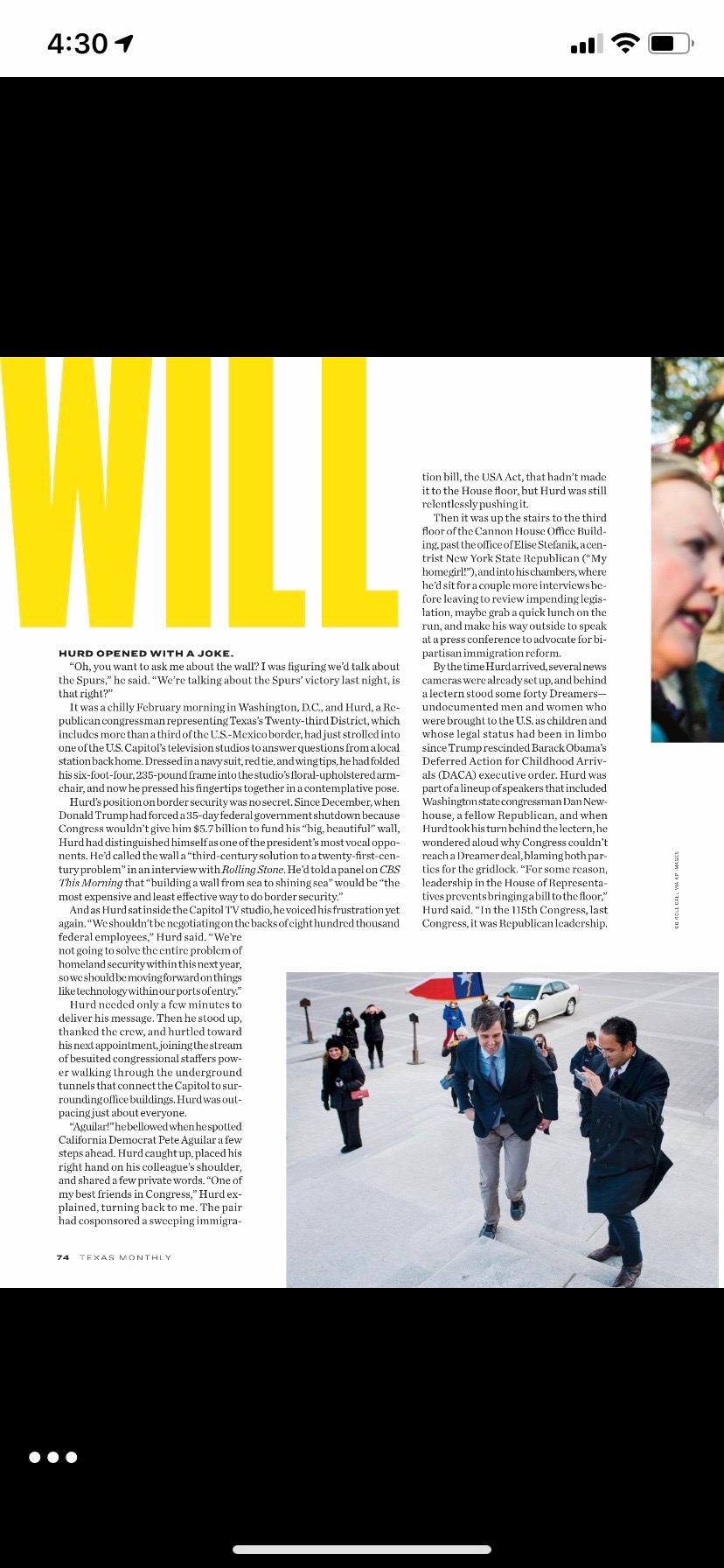
It looks like the answer is, mostly, yes. Comparing the versions of magazine issues that appear in Texture against those in Apple News Plus, there are quite a few magazines that have upgraded to something more readable — it’s perhaps the clearest success in the new offering. A few examples: Here’s Architectural Digest, first how it looks in Texture and then how it looks in the new Apple News Plus.
ESPN the Magazine:

Mother Jones:
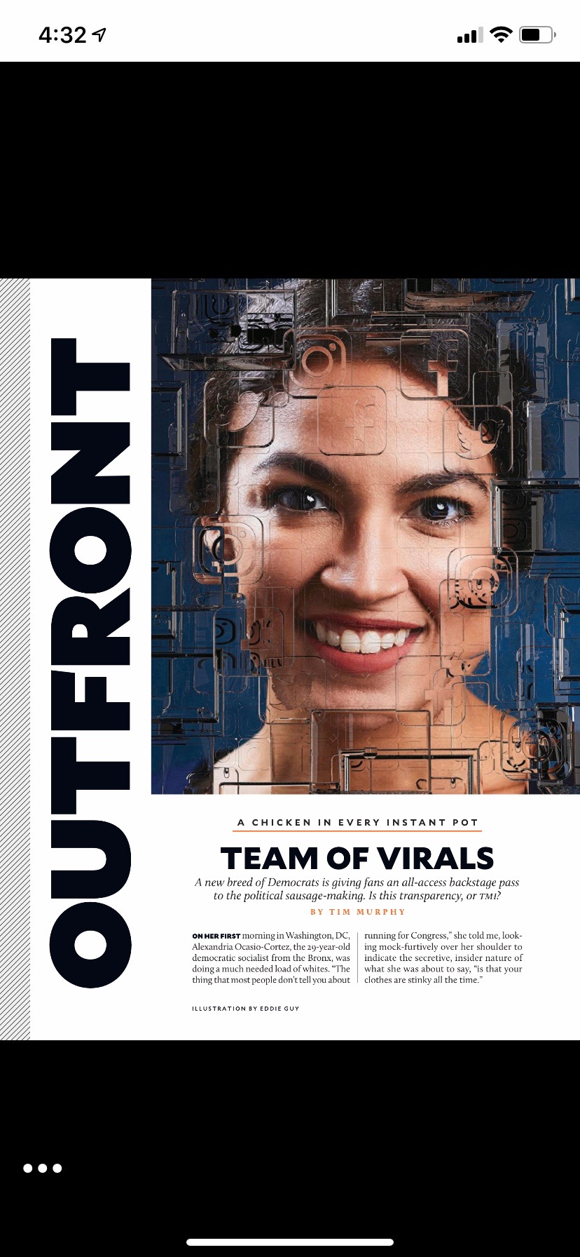

Newsweek:
Texas Monthly:

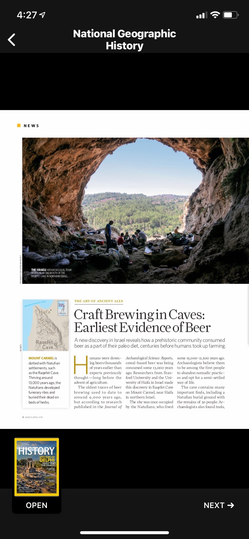
But there are still exceptions, like National Geographic History, which still use ill-sized PDFs:
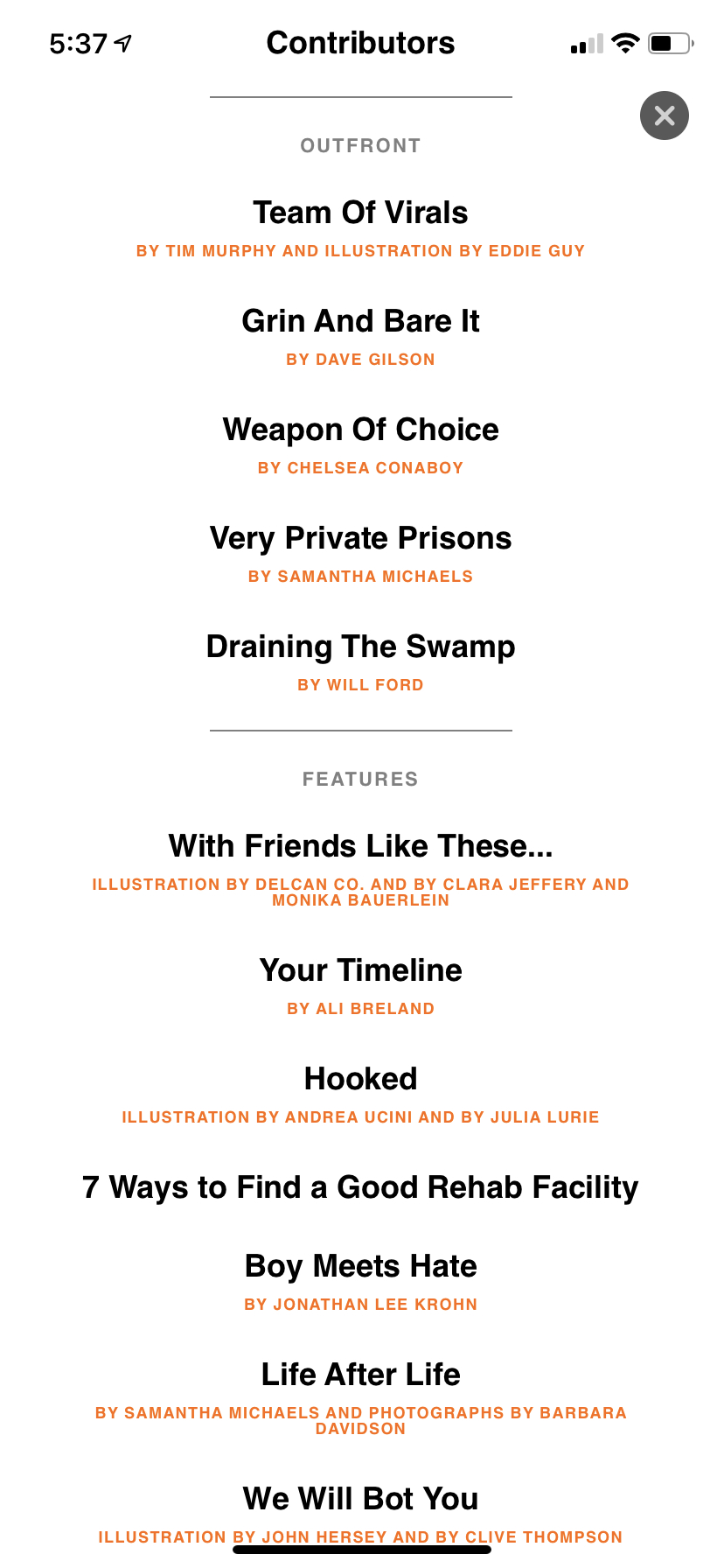
An aside: The presentation still isn’t perfect. For example, an issue’s table of contents seems to use the print edition’s headlines without any context — so a reader looking for an article to read has to guess what topics (in this Mother Jones issue) “Weapon of Choice,” “Your Timeline,” “Grin and Bare It,” and “Hooked” are about.
We’ve written before about the extent to which digital news subscriptions seem to be following a power-law pattern: huge success for a few, weak results for many. In newspapers, that’s meant that the Times, the Post, and the Journal have been able to build successful digital subscriber bases in the millions — but that smaller newspapers have struggled to achieve anything like their conversion rates. One question is the degree to which most people — that is, people who aren’t news junkies like most of you reading this article — can be convinced to get more than one digital news subscription. If you’re paying for the Times, will you also pay for The Yourtown Daily? Or is like streaming video, where Netflix and Amazon and Hulu can make lots of money but smaller fry get left out?
Apple News Plus is a paid “news” product in which only a very small share of the money generated will end up supporting the production of daily news, watchdog journalism, or investigative reporting. Apple will keep half of the cash; the rest will be distributed to publishers based on their share of readers’ attention, and the sheer number of magazines makes it likely most of that will go toward the softer side of news. There’s nothing wrong with that. But I suspect some people will think: I pay for Apple News Plus. Why do I need to pay for anything else?
And related to that:
Unless you happen to live in Los Angeles, Apple News Plus will offer you approximately zero news about your local community. The work that local newspapers do — covering and providing accountability in their towns and cities — is the single most endangered part of our news ecosystem and the part that plays the most important role in our democracy. And this new product likely harms local news on net; I’m sure there will be people who will see the choice as “pay 10 bucks a month for my local daily” vs. “pay 10 bucks a month for 300 magazines” and redirect money that might have otherwise gone into local news.
Perhaps it’s expecting too much of Apple to make even a tiny dent in that problem. Those hundreds of magazines are published by only dozens of companies; they’re easier to deal with than the far more scattered world of local newspapers, and Texture already did that work, anyway. And of course Apple operates on a national and global scale; news out of Kansas City is unlikely to interest a reader in Kalamazoo, much less Kolkata.
But Apple likes to present itself as a force for social good. It wrapped its presentation today in the clothing of important journalism, of civic values, of connecting communities and the world. That its news product finds room for ABC Soaps in Depth but not the Arizona Republic, The Pioneer Woman but not The Philadelphia Inquirer, Family Handyman but not The Flint Journal is not surprising — but it is disappointing.