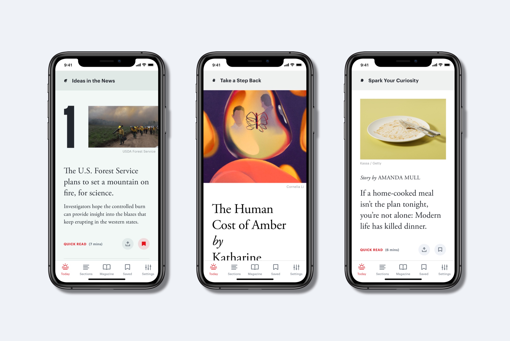
Along with a redesign, The Atlantic launched a revamped iOS app Tuesday.

The iOS-only app starts off with a “Today” screen, curated and written by humans, which users can scan for free. The newsletter-iness of that section is intentional, said Adrienne LaFrance, executive editor. The text in the Today screen changes according to the time of day; depending on when you’re reading, you’ll be greeted with “Good morning,” “Good afternoon,” “Good evening,” or “Still awake?”
That Today screen is free, but to click through to any of the articles or to read any of the app’s other content, users will have to pay. (The Atlantic’s website, in comparison, has a metered paywall; visitors can read five stories free per month before they have to pay.) Most of the users of The Atlantic’s app are subscribers anyway, said Andrew Phelps, senior director of product (and a Nieman Lab alum): “Our app audience is the most loyal and engaged of any surface where we reach people. Something like three out of four come to the app at least three times a week, and that was to an app that largely just looked like the homepage of The Atlantic. Until now, it hasn’t been terribly different.” But those who aren’t paying yet can subscribe to the app for either $4.99 per month or $49.99 per year.
@TheAtlantic's new iOS app shares a nearly identical UX with the @NewYorker's iOS app. Differences:
Atlantic's home feed = a newsletter whereas TNY is a list of articles
both emphasize consuming "complete" print issues
both prioritize on-demand reading (bookmarks) pic.twitter.com/aGSAN0XrTv
— Noah Chestnut (@noahchestnut) November 12, 2019
a few more
…
neither the Atlantic or TNY emphasize asking users to receive push notifications (or even make a case as to why)
both feel a bit cluttered and force the reader to navigate the masthead/org
(bonus) TNY plays up it's cartoons and I love 'em for that pic.twitter.com/TWBbXKCJ8W
— Noah Chestnut (@noahchestnut) November 12, 2019
I'll end on this…
As the design for reading thoroughly & intentionally edited writing starts to all merge into one style… who benefits & who loses?
As a reader I like that things are all pretty easy to read. As a "publisher" it feels like we're ceding everything to iOS
— Noah Chestnut (@noahchestnut) November 12, 2019
One comment:
Heya i am for the first time here. I came across this board and I to find It really helpful & it helped me out much. I’m hoping to provide something again and help others such as you helped me.
Trackbacks:
Leave a comment