New York Times journalist Maggie Haberman’s tweetstorm on the weaknesses of Donald Trump’s personality when he’s tired was retweeted over 1,500 times. Rukmini Callimachi, the Times’ ISIS and Al Qaeda correspondent, regularly provides context and color around her reporting on Twitter. But as both our Josh Benton and Recode’s Peter Kafka have pointed out, the Times and other publications haven’t always had a great way to capture the value of that content.
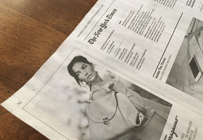
The paper’s newly redesigned pages A2 and A3 will highlight some of that content — and the “huge scope of activity that’s going on in the world of The New York Times on any given day,” said Jake Silverstein, the editor-in-chief of The New York Times Magazine and one of the leaders of the redesign.I spoke with Silverstein late Thursday about the revamped pages, and what I thought would be a short conversation to grab a quote or two turned into a broader discussion about how the Times sees print and digital working together — how the mediums can “be friends,” in Silverstein’s words. Our conversation, condensed for clarity and length, is below.
Our focus turned to A2 and A3 when we realized we’d never thought of that spread as a cohesive, regular experience that was the start of a reading routine. It had been a place where people put stuff that they didn’t know where to put elsewhere. We’d put news stories there that didn’t fit anywhere else.
But habituation is a big part of what makes the print reading experience enjoyable, and we wanted to try to create a new set of habits on these two pages.
Part of the goal was to create something that was entirely visible in one open spread of the newspaper, that used some of the rhythm and pacing and design of a magazine front-of-book — the difference being that the whole front-of-book is laid out before you turn any pages, so your eyes can wander around small content and small features, latch on to one thing and then drift over to the next thing. There’s something leisurely and pleasurable about that. It’s kind of an appetizer course before you get to the rest of the paper.
But we also recognized that there were some important functions this page could play — not only warming people up but offering a dashboard of the huge scope of activity that’s going on in the world of The New York Times on any given day. That scope has expanded in recent years to take in not only what’s happening in the print paper and videos and podcasts and various institutional social media accounts, but also our live journalism, and all of our journalists’ own social media accounts.
Much of that was never captured in our more formal products. There wasn’t a single place you could go to see all that. We felt that, with judicious curation, we could present an overview of the highlights from all the different areas that now constitute what the Times is doing.
To the left of that we have The Conversation, the list of the most read and shared and discussed posts online. Part of what we’re trying to do there is offer some of what you’re not getting if you only read in print, because the most read or most popular list is something you can only get on the Times’ website or the app.
It’s very interesting to know what the other readers of the Times are responding to, clicking on, and sharing. It informs your sense of what the most important stuff is. The Conversation has a little bit of context about why this stuff is popular and what some of the feedback has been. The idea is to pull in some of the work that’s being done on digital platforms that’s not appearing in print — but in a way that doesn’t make the print reader feel they have to go to the digital platforms to get the full experience. These things aren’t meant to be referrals to the digital experience, but small encapsulations.
The Mini Crossword is a great example. It’s something that before [Thursday] only existed digitally, but it’s totally addictive; people love doing it. We’ve taken something born digital and brought it into print. It completely flips on its head the way that the Times, and any newspaper, have done business, because up until now, most things have been born on print and moved to digital.
One thing that’s been cool on this project is seeing how print and digital can be friends. They can work seamlessly. Print has a curatorial function, because there’s a limited amount of space and a need to arrange things on a page that looks good, and that forces you to make cuts and put emphasis on certain things. It’s not that people can dump anything on the website, but having unlimited space changes the way you approach things. The curatorial quality to print is useful, and in this case, it’s given us a sense of how to arrange information that can be useful to us on our digital platforms as well.
What you see here is the recognition that we want to be out there explaining to people and making sure they understand the incredible amount of effort and complexity and resources and ingenuity that goes into making Times journalism.
As a reader comes to that Inside the Times slot every day and starts to see how the newsgathering operation of the Times actually works, we’re hoping it’s going to be deeply instructive and inspirational. The workings of the press are under intense scrutiny and also renewed interest right now. I’m excited to see this feature’s impact on the way people read the paper.