Last week marked the 25th anniversary of the 1.0 release of NCSA Mosiac, the first important web browser, the one that led to…well, everything else that’s happened online in the past quarter-century.

(Weird to see “World Wide Web” be listed as just one of the various systems Mosaic could work with — and only in third place!)
Mosaic looks comically basic today, of course, with its default grey background, utter lack of layout (even <table> was a year-plus away), and general aesthetic case of the blahs. But from such starts spring miracles.

We built something weird and wonderful @girlboss. I could use my 2M characters to talk about it, but better you go check it out at https://t.co/4oJbv6yKNP… pic.twitter.com/1fzjuJJ3A1
— Neha Gandhi (@nehaintown) April 18, 2018
There are a number of interesting things about it (see here), but I want to mention the one that got my early-web-nerd radar a-blooping. From Neha’s email:
Ultimately, this is a move toward color-bad-font-soaked maximalism on the design side countered with digital minimalism on the performance side, using only system fonts, with every design decision made to support the fastest possible mobile experience, and with a strong commitment to creating the right experience to support our content mission of making a few great pieces each day that are entirely original (no aggregation, no 150-word write-around, etc) that is meant to truly add value to each user’s daily life.
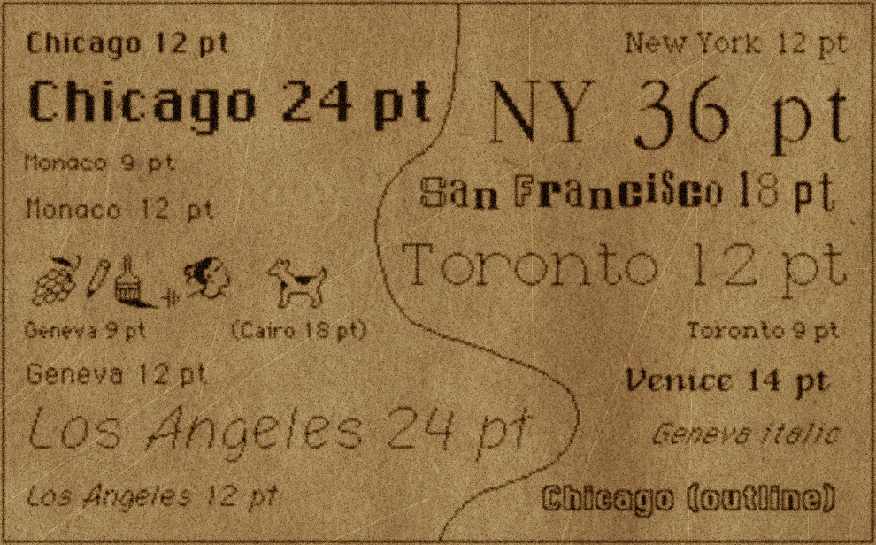
Emphasis very much mine. System fonts! One of the many limits of Mosaic back in the day was that you couldn’t specify what font a piece of text would appear in (that didn’t appear until 1995). And when you could specify a typeface, you had to rely on whatever the end user had installed on her device — fonts like Palatino, Gill Sans, Monaco, Ariel. (It was a big deal in 1996 when Microsoft released a new set of fonts free for all to use online, which came to dominate the next decade of web design: Georgia, Verdana, Impact, and yes, Comic Sans.
Eventually, custom web fonts became a thing, especially after the launch of Typekit in 2009. Soon it was easy to use whatever font you wanted. Which was wonderful! Nearly 7 in 10 websites use custom web fonts today. But it also contributed to page bloat, including slow download times on mobile. One recent test found that loading a custom font from Typekit could add almost a full second to page load — and that’s on a fast desktop connection. Switch to mobile and those lag times blow up: Here’s one test that found a news site was adding 10 seconds of load time on a fast 3G connection, thanks to custom fonts.
With 70 percent or more of many news sites’ traffic coming from mobile, it’s worth re-examining some of the design choices that might have made sense on our iMacs, but don’t on so-so South American 3G.
Which is why I thought Girlboss’ redesign was noteworthy: Using system fonts means no added download time, no extra data used, and a look designed to blend it with the device you’re using. The current top headline on Girlboss will render in Future, Franklin Gothic, Segoe, or generic sans-serif, depending on where you’re viewing it. One lower down will show up in Optima (!), Candara, Calibri, Trebuchet, or generic sans-serif.
I confess this is an idea I have an irrational love for (and have since Medium pulled off something similar, if less ambitious, in 2015):
I have deep love for the idea that an OS update can change a website’s fonts. https://t.co/lQMq3Ox5Ck Makes it feel native to the device.
— Joshua Benton (@jbenton) October 8, 2015
You can certainly have opinions about the aesthetics of Girlboss’ design. (I haven’t seen this much Futura Condensed and Optima since laying out my college paper in Aldus Pagemaker circa 1994. Then again, brutalism has been hot for a while now.) But whatever your opinion, it’s a clear choice driven by user experience — namely, getting to a fast download. I asked Neha what else was mobile friendly about the redesign: “No interstitial [ad] units, live text wherever possible [as opposed to images of text], limited third-party beacons [adtech, ugh], no right rail ad unit to design around, no bells and whistles that go beyond the essentials — all of the personality added in here comes from color, a mix of fonts, and of course the actual content.”
A big part of the appeal of the various distributed-content platforms — Facebook’s Instant Articles, Google’s AMP, Apple News — is that they promise to correct the garbage experiences so many news websites offer their readers on phones. Each of those could be a good choice for a particular publisher in a particular situation.
But I’d rather that news sites focus on cleaning up their damned websites. All else equal, you’d rather your readers come directly to you than through a tech company’s algorithms; the experience you offer your website’s readers should be the best one they can get. The Girlboss redesign realizes that — and maybe we really should go back to the web’s past for inspiration.