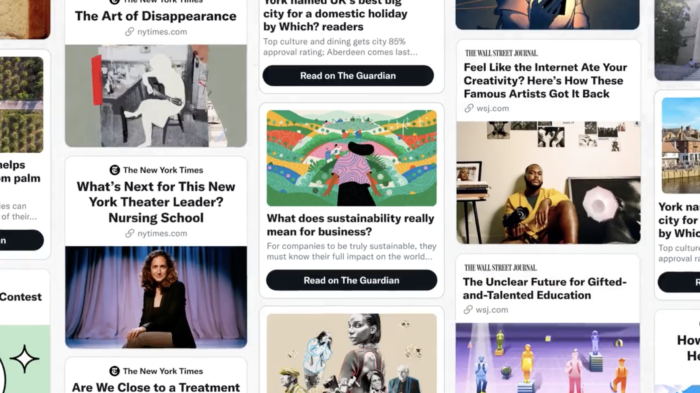
Have you noticed that some news article cards on Twitter are looking a little different lately? The social media company rolled out Tweet Tiles — “a new, customizable way to expand the creative surface area of a Tweet” — to three news publishers last week, a Twitter spokesperson confirmed.
The change is one of the biggest tweaks to article preview cards since summary cards appeared on the scene back in 2015. The customizable image, format, and interactive elements could help news orgs distinguish themselves in feeds and, ultimately, drive more engagement.
For the experiment, Twitter partnered with The New York Times, The Guardian, and The Wall Street Journal. (The three news publishers were selected for their “highly engaged and trusted audiences,” according to Twitter.) Tweet Tiles will be visible to half of people on iOS and Web, with the other half seeing standard summary cards.
Today we’re beginning to test Tweet Tiles with @nytimes, @wsj and @guardian. Tweet Tiles will let developers extend the Tweet experience and will pave future innovation for our @TwitterDev developer community🚀 https://t.co/LDyExFq4b1 pic.twitter.com/mKeU87jNIv
— Amir Shevat (@ashevat) August 25, 2022
Twitter plans to make the feature available through the Twitter API in the future, giving more newsrooms the ability to create their own publisher-specific cards.
Looks like Twitter are testing some new publisher specific cards with additional formatting options? pic.twitter.com/2mX6dfFEiq
— Matt ‘TK’ Taylor (@MattieTK) August 25, 2022
Twitter’s new “developer-built card” allows publishers stylize link previews in a Tweet
It’s much appreciated, but will Twitter still be favoring photo/video Tweets over link Tweets in the Home Timeline? (something many news outlets do) https://t.co/uB48APpfnv pic.twitter.com/VBUEJC0x4M
— Jane Manchun Wong (@wongmjane) August 25, 2022