If newspapers are the first draft of history, then consider these the first sketches.
In the video above, San Diego developer and artist Tim Schwartz shows off several visualizations of history he created with The New York Times’ entire 158-year corpus as his dataset. They are alternately quirky, beautiful, and probing — hundreds of millions of words synthesized into coherent, historical portraits.
I met Schwartz earlier this month at Times Open, the newspaper’s conference for developers. He was interested in the Times’ newly released APIs, which could help facilitate his work while expanding the potential for analysis. (However, they only go back to 1981.) And while there are many potential uses for the APIs, the most exciting so far have focused on representing history through the pages of the Times, transforming piles of newsprint into informative art. Or maybe we should call it artistic journalism. In any event, it’s a step up from papier-mâché.
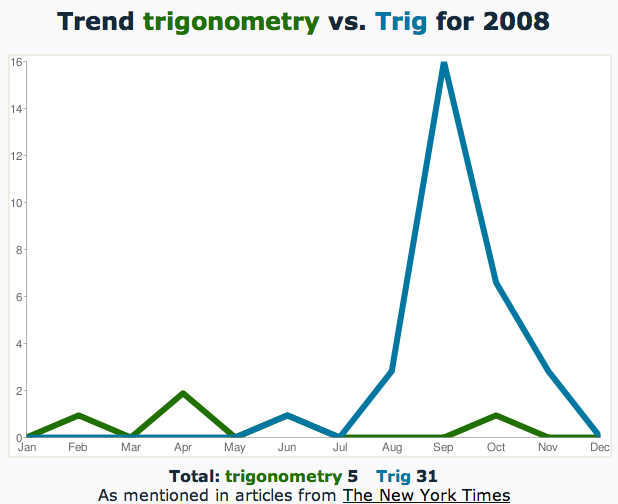
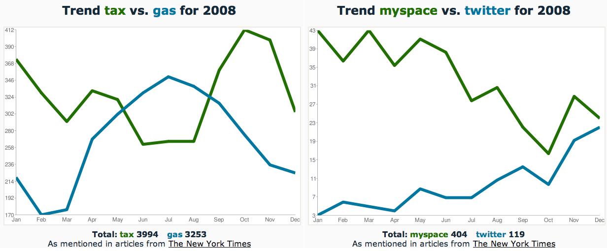
The emerging field of visualizing newspapers appears to have just a few practitioners, but the Times APIs are likely to spread the craft. In fact, you can participate right now with a fun little application built by Derek Gottfrid, a senior software architect at the Times. It’s a proof-of-concept — not high art — that lets you chart mentions of any two words in the Times for each month of 2008. I’ve been playing around with visually interesting pairs like the two below. Let me know what you find.
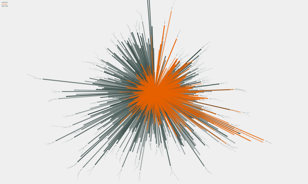
However, there’s a lot to be said for the aesthetics of this field, and its pioneer is Jer Thorp, a Vancouver artist whom I’ve mentioned previously. Below is his latest piece, which visualizes the frequency of “socialism” (orange) and “capitalism” (green) in the Times between 1984 and 2009, sweeping around like a clock. The bursts — for instance, of socialism in 1989 — capture the charged events they represent.
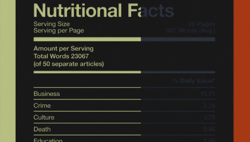
Thorp, whose work is for sale, told me he’s “planning on doing some physical objects that interact with” the newly released Times Newswire API. He also pointed me to a few other visualizations of newspapers, including “One week of The Guardian,” a series by Dave Bowker, a designer in London. Below is a snippet of one day’s work in which he sorted The Guardian’s 23,067 words into news categories like death and culture. Not as much of either as you might expect! (Someone alert the Berkman Center’s Ethan Zuckerman, who has championed “nutritional labeling” of news.)
Jeff Clark, a programmer outside of Toronto, was busy in 2008 playing around with various visualizations of media like the one below, which graphs the frequency of popular words in The Toronto Star throughout 2008. He also created an application called News Spectrum that charts word associations in news articles.
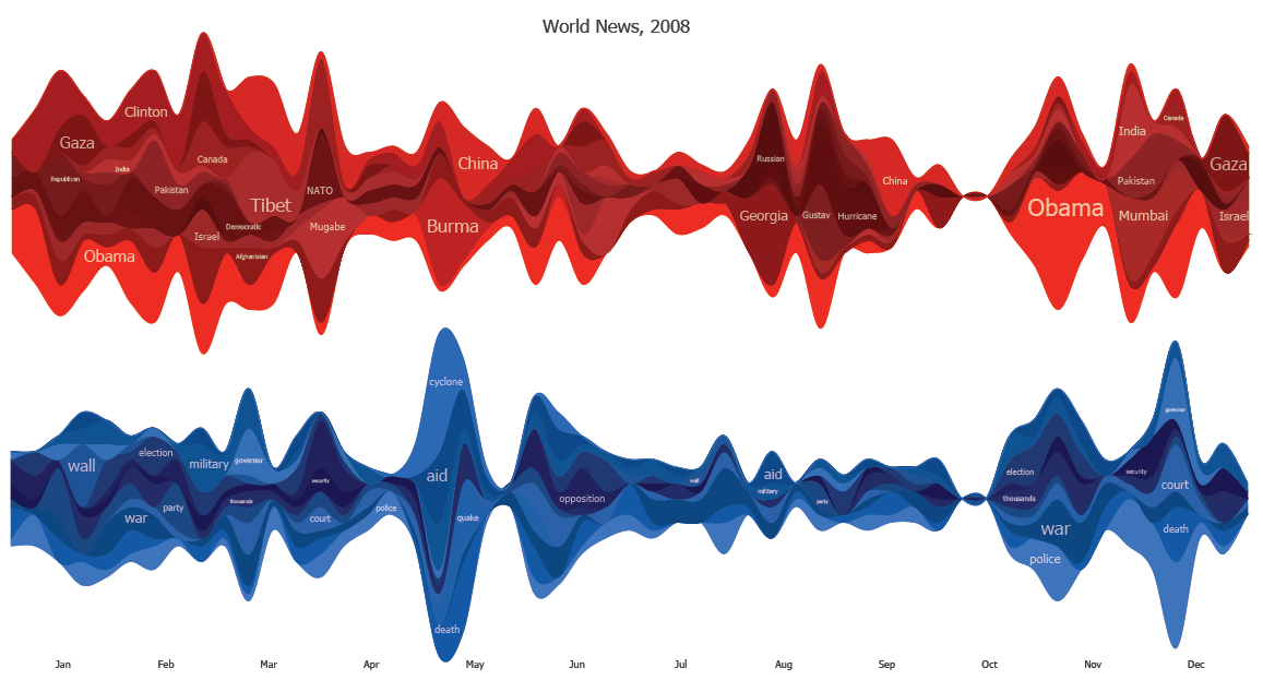
Aside from looking great, these pieces explode the news story model, freeing words from the confines of their original articles, while still committing acts of journalism. They also offer a more specific — and, I’d argue, more accurate — notion of history: events as they were interpreted by the newsgatherers of their time.
That sort of thinking inevitably leads to the history of history’s interpreters. And along those lines, copyeditors will appreciate “The Quick Brown,” a website by Amsterdam designer Jonathan Puckey that tracks headline edits on FoxNews.com. At its best, the automated site reveals those elegant but silent tweaks that tighten a phrase or clarify its meaning, like the examples below at left. Puckey also created a similar project in print, below at right, that toys with the transience of online breaking news.

There are a few more: I’m reliably informed that this beautiful German project is a visualization of newspapers, but I don’t speak the language. And other artists have built works that interact with the news through search terms — like a rice cooker that activates when it finds articles about genetically modified rice and a wearable device that inflicts pain on the user upon reports of torture, war, and other bad news. (The latter appears to be just a conceptual joke, which is probably for the best.)
But sometimes all you need is a simple visualization to find order in what Thomas Carlyle called the “ever-working Chaos of Being.” My friend Simon Vozick-Levinson, a music critic at Entertainment Weekly, suggested plugging the following pair of words into Gottfrid’s application to capture what 2008 was really all about:
