
Congratulations, New York Times readers: You can now think of yourself as beta testers.
The Times has released a new browser tool that will let readers test experimental features on NYTimes.com in real time. With Test Drive — available as a Chrome extension, a Firefox add-on, or as a simple bookmarklet — readers can test experimental web features the Times doesn’t think are yet ready for the big show.
The experimental features currently in Test Drive include NYT Accessible, which optimizes the site for visually-impaired readers, and TimesInstant, an article search that produces results while you type. Once Test Drive is installed, you can toggle the experimental features on or off at will.
These projects were created by the Times beta620 group and have already been available for testing on their site; Test Drive puts these ideas into on wrapper and lets the Times take them out of a static lab state and into a real world environment. The goal of beta620 is for developers, designers, and others to tinker with ideas that have the potential to enhance the Times online or through apps. (Times HQ is at 620 Eighth Avenue.)
“We love beta620 — it’s been a great experience and a great way to get our innovations in front of the public before they’re fully baked,” Marc Frons, the Times chief information officer told me. “The downside of it was that it was a separate website.”
David Erwin, a software engineer with beta620, said the point of their work was to see how these experiments would play on NYTimes.com. By keeping them on the beta620 site they couldn’t really test that. “The key moment for me was, why not have a framework to actually bring the projects designed for the live site into that everyday experience so they can be used where they belong?” he said.
The web has pushed journalists to be more willing to expose the workings of their reporting — blogging stories in progress, tweeting updates from a scene before filing. But the beta mentality of letting users play with new features before they’re ready to ship has a long history in the technology world.
Of course, the kinds of people who discover and install browser extensions are not a random sample of Times readers as a whole. Frons says they’re okay with that. ‘It’s not like a traditional A/B test where you’re actually just throwing something else up on unsuspecting readers and measuring your clicks,” he said. “I think the quantitative data will be less important here than the qualitative, where people’s comments and our own understanding of how we’re using these tools and experience will be more important than measuring clickthroughs or that sort of thing.”
The Times’ innovation staffers have created several features that have “graduated” into wider usage on NYTimes.com, including the article recommendation engine, Times Skimmer, and the up next box that slides into view at the end of a story. (Some of those were internal Times innovation projects started before beta620 was officially christened last summer.) It wouldn’t be hard to imagine TimesInstant and NYT Accessible joining that group. TimesInstant was inspired by Google Instant and is seen as a means of making searching the Times easier, particularly if you’re not entirely sure of a proper name, place or event. While it doesn’t give you predictive text as Google does, it provides results as you type.

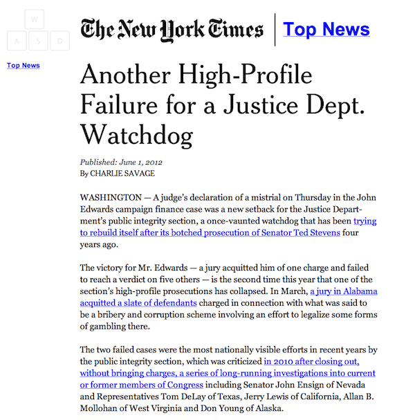
Erwin said NYT Accessible is aimed at making the site more friendly to vision-impaired readers, stripping away some of the elements of a Times story page that can confuse screen-reader technology. So instead of a page with an array of links, the recommendation box or ads, a user would get just the headline, byline, and text of the story along with enlarged photos. (It’s also a vision of a stripped-down, minimalist version of the Times that some designers with perfectly fine vision have clamored for.)

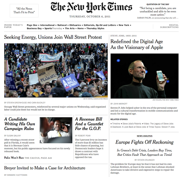
On a broader level, Test Drive is a way for the Times to let readers make a personalized experience on NYTimes.com. As new modules are added, readers will have a customized layer they can turn on and off at will. “At some future date, you may see what looks like an entirely new website on Test Drive and then be able to switch that off and go back to NYTimes Classic, or whatever we’re gonna call it,” Frons said. (For example, check out beta620’s Late Edition, which imagines a NYTimes.com front page that trades link density for scrollability.)

Image by Chris Devers used under a Creative Commons license.