Being a digital staffer at a traditional news organization means doing digital work, sure — but it often also means serving as an evangelist for the web. That can take a mixture of convincing, cajoling, and showing by example.
 When Melody Joy Kramer joined NPR as a digital strategist last year, she knew working to shift its culture toward digital, social, and analytics would be a core part of her work. As she put it in a talk at the International Symposium on Online Journalism earlier this month: “If you start out at a new media startup, it’s easy to say that analytics tools are part of your culture from the ground up. It’s a little harder at shops like my own, where there’s already a culture in place.”
Strengthening that new culture started with something small: a daily email. The messages laud good work from NPR staffers, point out ways to do things better, and highlight experiments at other outlets. (Last month, Kramer started posting the emails online for all to see.) Now reaching about 450 people inside NPR — including top management — the emails have led to other staffers sending Kramer examples of their own work, as well as links that they think would be worth sharing with their colleagues.
Today, NPR unveils the next step in that culture building: an analytics dashboard designed for NPR staffers to learn more about how readers and listeners are connecting with their work online.
“We started [the newsletter] several months ago, and I think that this product that we’re developing is an extension of that,” Kramer said. “It allows us to learn and hopefully share with our newsroom. I do think you have to think about the culture of your newsroom before introducing a product.”
Now, if you’re a web maven, an analytics dashboard might seem downright boring. But small things like an email or a dashboard can be powerful in building culture.
You may remember Kramer from our story in 2012 about her work building an online following for the public radio show Fresh Air. After a brief career detour outside public radio, she returned to the medium last year, working with compatriot Wright Bryan on NPR’s social media desk.NPR runs its development schedule in two-week cycles, and Kramer pitched her bosses on the idea to develop the dashboard in February. She was given six weeks — three cycles — in March and April to build it.

“We’re certainly not as big as many of our competitors,” said Patrick Cooper, NPR’s director of web and engagement, who was among the group who approved the project. “At the end of the day, we’re a nonprofit and we have to be as efficient with our time as possible.”
Very excited that the pitch made on Monday was successful and that We'll get three cycles of dev time starting in mid-march.
— Melody Joy Kramer (@mkramer) February 27, 2014
NPR already uses Google Analytics and Chartbeat to monitor its analytics. (Another part of the social media team’s work is to build small tools to make sharing easier; one of those is a bookmarklet to add Google Analytics tracking codes to the end of URLs.) While those off-the-shelf products are useful, Kramer and Bryan said they can be complicated to understand and don’t always provide the best information. Instead, they wanted to create a dashboard that allows NPR to use the data to inform their content decisions.
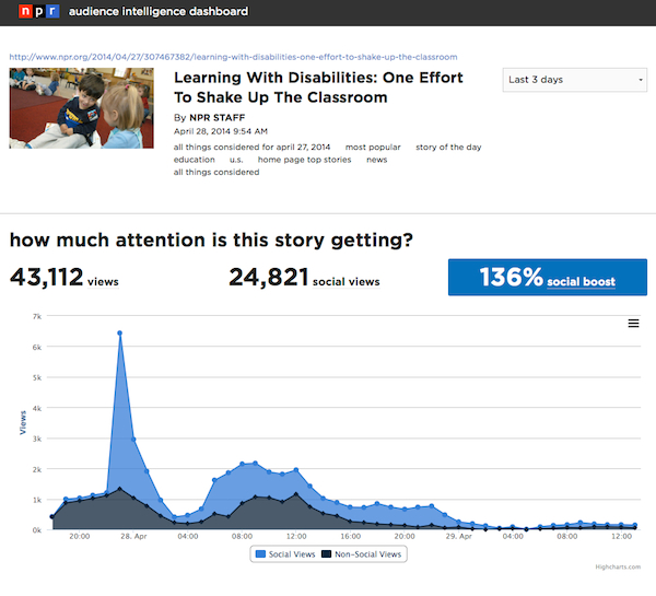
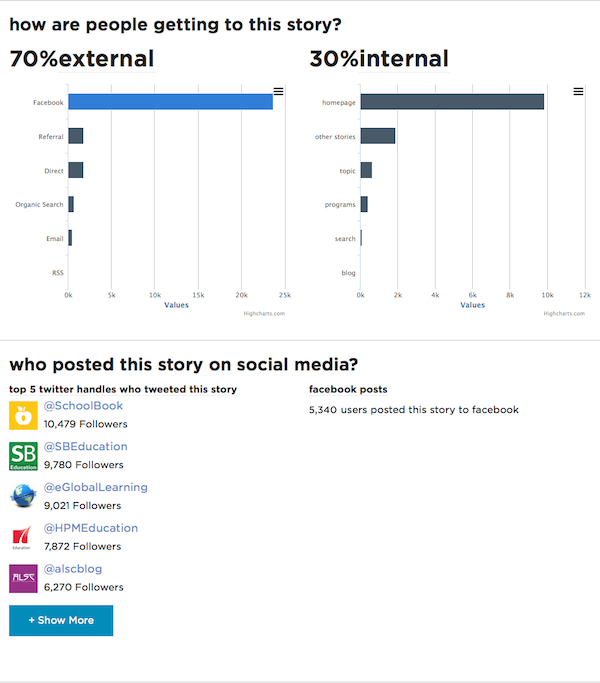
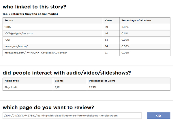
NPR doesn’t introduce any new form of measuring analytics with its dashboard; rather, it takes existing information and presents it in a way that’s more easily digestible. It clearly shows where a story’s traffic is coming from, how it’s being shared on social media and elsewhere, and whether readers are interacting with embedded audio or slideshows. The dashboard was designed to answer simple questions: How much attention is this story getting? How are people getting to this story? Who posted this story on social media?
The dashboard will be housed online and information from it will be sent out in a daily internal email, Kramer said.

“We wanted to try to bring together an abstraction of the best data we can pull together for our journalists, so they can look at it quickly and understand more about the audience and then make better informed decisions on the content side,” Bryan said.
In developing the product, Kramer, Bryan, and Scott Stroud, a user experience designer at NPR, met with representatives of The New York Times, BuzzFeed, the Atlantic, the Huffington Post, USA Today, and The Guardian to better understand how those outlets approach analytics.
In the past few days, I’ve spoken to smart people at the @HuffingtonPost, @buzzfeed, @nytimes, @TheAtlantic, @GuardianUS and @USATODAY.
— Melody Joy Kramer (@mkramer) March 20, 2014
After touring other newsrooms, the team developing the dashboard met with the head of every show and desk at NPR and shared what they’d gleaned on the email listserv as well as in a lunchtime talk. “This kept everyone in the loop and invested in the process,” Kramer explained in that ISOJ talk:
Then, we started thinking about what UX people call personas. I don’t know if you’re familiar with that term, but we came up with several. Some of them were: I am a homepage editor, I am an editor of a section, I am a blogger at NPR, I am a radio reporter, I am a producer. Then we sketched out what each of them might need from a dashboard because each of those people might need something different.
It was really important to think about what our audience — which in our case, was our own newsroom — might need, because if you build a tool and the newsroom finds it difficult to understand, difficult to use, difficult to access, difficult because of company culture, or difficult to share, then what’s the point?
Keeping in mind those contingencies and the need to adapt to the company’s culture, BuzzFeed’s analytics dashboard was a main inspiration for the NPR team, Bryan said. “Following their lead, we’re looking at the impact of social on our traffic and trying to better understand that and where people are coming to us from,” he said. The BuzzFeed dashboard, a version of which is publicly available, shows the site’s traffic figures and highlights the role of social networks in generating traffic in an easy-to-understand way.
Another takeaway from their newsroom visits? Relative data is just as important as absolute data. “We know a politics story isn’t going to do as well as a pop culture story necessarily, so how do we create a measure that allows us to see success for what it is,” Bryan said.
Though the data from NPR’s finished project won’t be shared publicly, they are planning on meeting again with the other organizations they met with to share the finished dashboard and share the lessons they’ve learned through the development.

The initial dashboard is a barebones version of what they’d ultimately like to get done. Eventually, they envision a version of the tool would allow users to easily share information with each other. And while the current dashboard will focus on individual stories, they’d like to build it out to an aggregate level to view information on specific blogs, topic pages, or even the NPR homepage.
“What our vision is for it and what will get built will be two different things,” Bryan said. “When we get to the end of the six weeks we’ve been given, we’ll have a good product for the newsroom to use, but we’ll have a good roadmap to build it out further.”